18 findings from AI, 2 of them worth keeping
I ran a heuristic UX audit of a live onboarding flow with Claude Design — to see whether AI could catch what a tested, refined flow had missed
Context
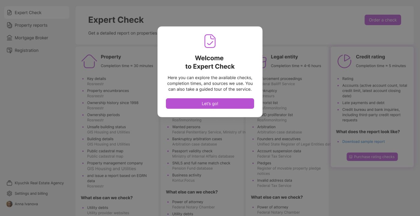
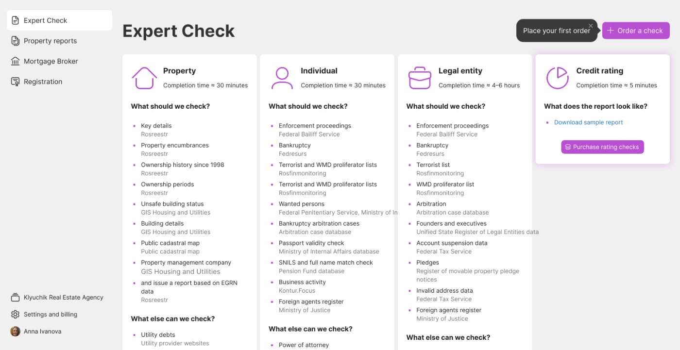
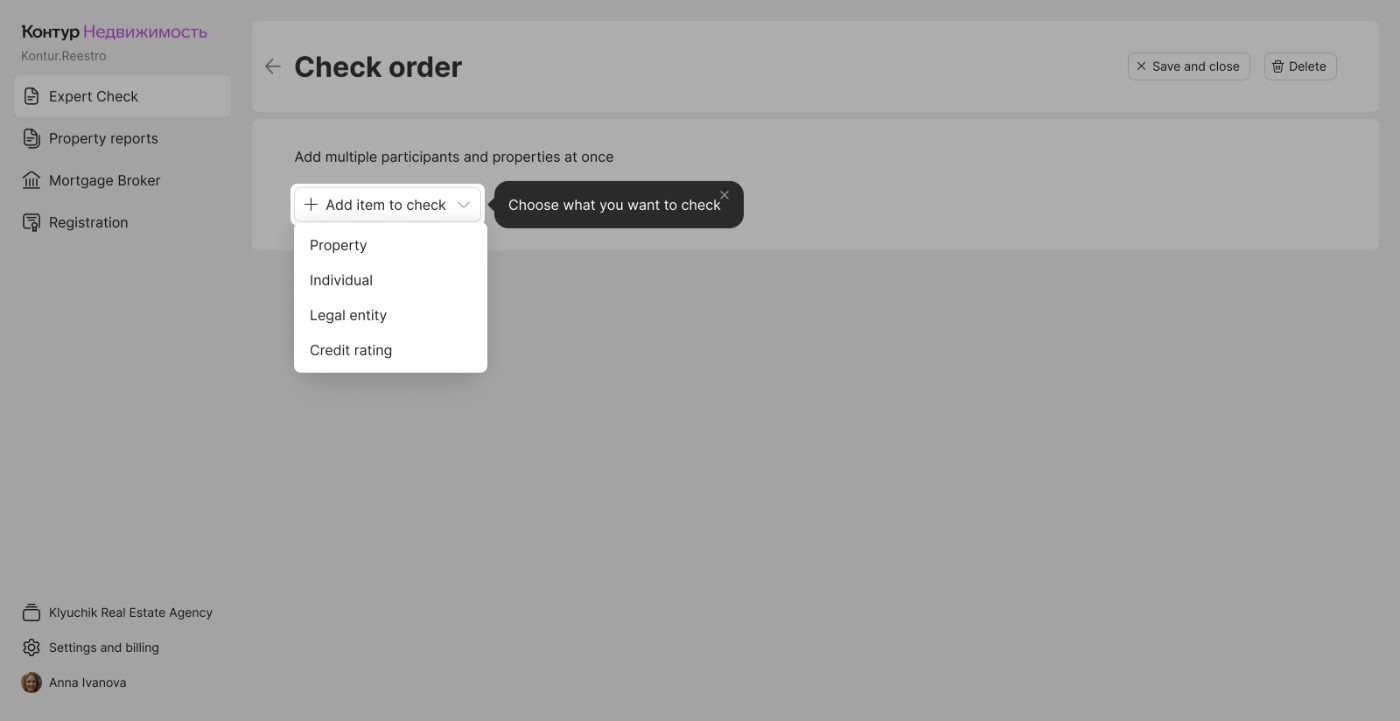
I took the onboarding flow from my previous project, PerCheck. It shipped about 3 years ago, was tested with real users and refined after that — and I asked Claude Design to audit it against Nielsen's heuristics.
The point was to see whether AI could spot something I had overlooked, or argue with decisions I had already made at the time
Limitations
On a PRO plan the usage limits meant I could not feed the model all the context of the product. I shared onboarding screenshots and a short description of the product and the flow; the links I gave it were not reachable from its environment. So the AI only used what fit inside the limit — isolated screens, not a working product.
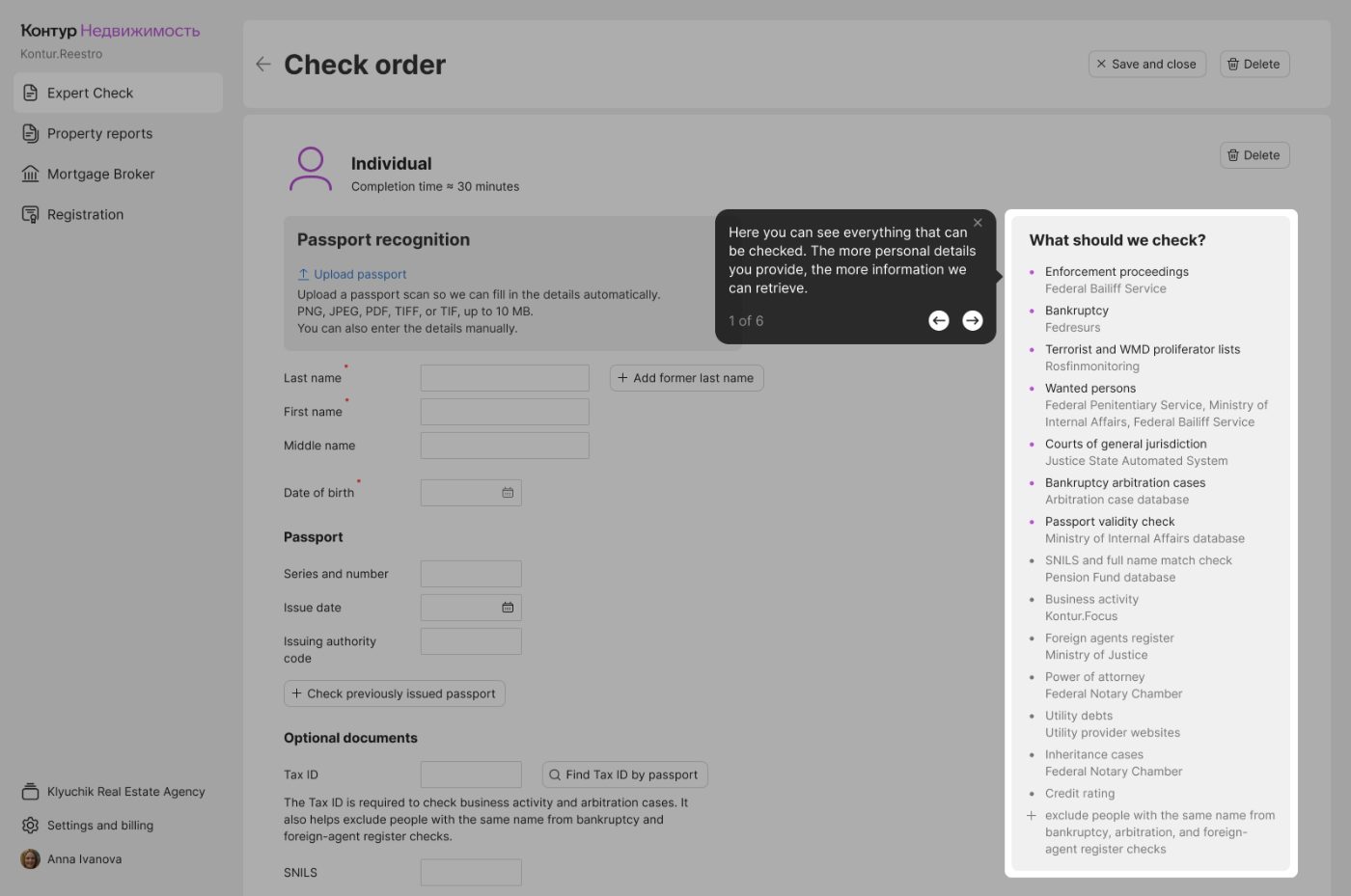
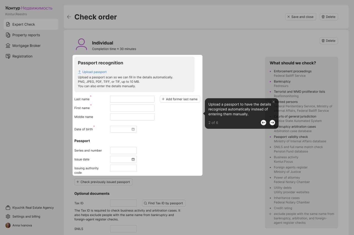
What came back
Claude produced 18 findings. Without the full flow and the business logic behind it, the model reasoned from screenshots alone, so it raised «problems» that were never problems in the product. For example:
- it flagged the missing progress bar — which was left out on purpose, because the flow is non-linear and has no fixed order of steps;
- it proposed preset configurations — impossible here, since there is no way to predict which entities, and how many, a user will want to check.
I went through every finding and kept only what held up against the product.
The 2 findings worth acting on
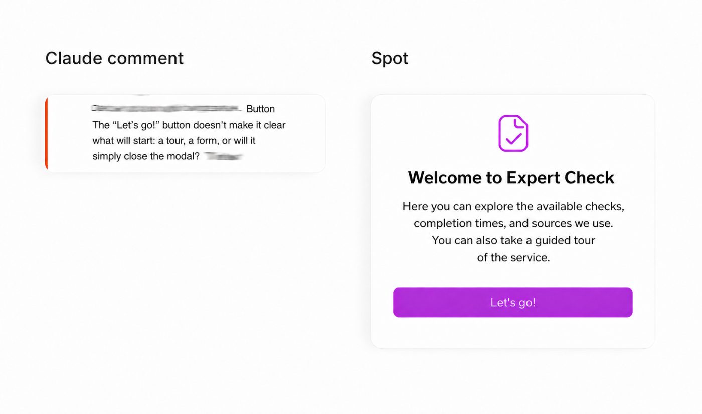

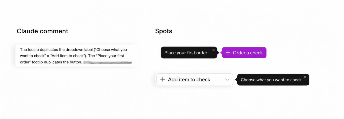
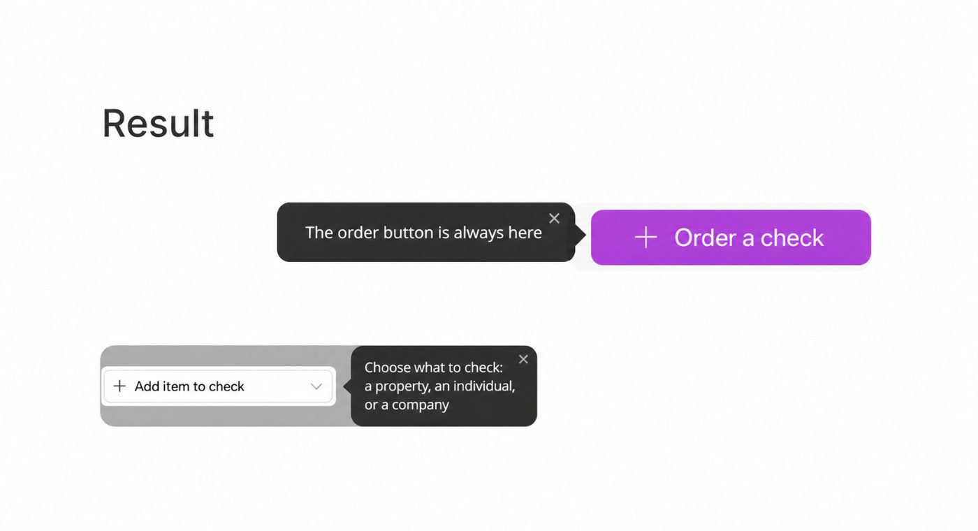
AI is usable for a UX audit, but its output tracks the context it is given. Without enough of it, the model:
- writes generic, textbook conclusions;
- misreads how the flow actually works;
- suggests solutions that ignore the business logic behind the product.
At the same time, even with limited data, AI can highlight certain growth points that can be used as a starting point for further analysis. Even so, it pointed at growth areas worth a second look.
What I took away
I would use it as a supporting tool: collect hypotheses, judge each one, drop what does not apply, refine what does. A good assistant — but it cannot fully replace a designer or a researcher.