A B2B service designed from scratch, without a clear product vision
Mortgage brokers ran the whole loan process across spreadsheets, mail and bank portals. I had to pull it into one place — and the only way to know what “one place” meant was to go and ask them.
Context
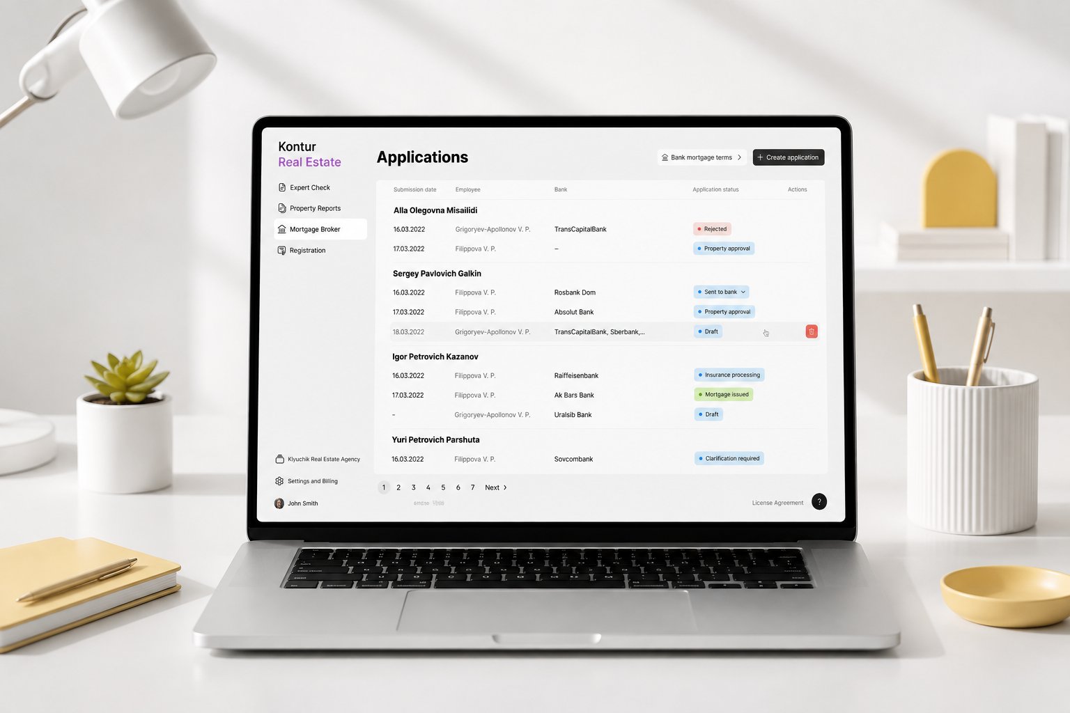
The service helps mortgage brokers run the entire loan process — collecting client data, assembling the application, and submitting it to several banks at once.
The business had no clear picture of the product it wanted —
so we worked it out as I researched and designed it
Constraints
Research & discovery
I ran the research end-to-end: wrote the discussion guides, moderated the sessions, synthesised the findings and presented them to the team. It happened in 2 rounds:
Round 1 — interviews with elements of usability testing
First I studied a lot of competing services and walked through their flows, to see how this kind of work is usually solved. Then I sketched a couple of initial screens, wrote the questions, and went to brokers to run 5 interviews and verify my assumptions about how they actually work. The assumptions mostly held up — and this is the workflow that came out of the sessions:
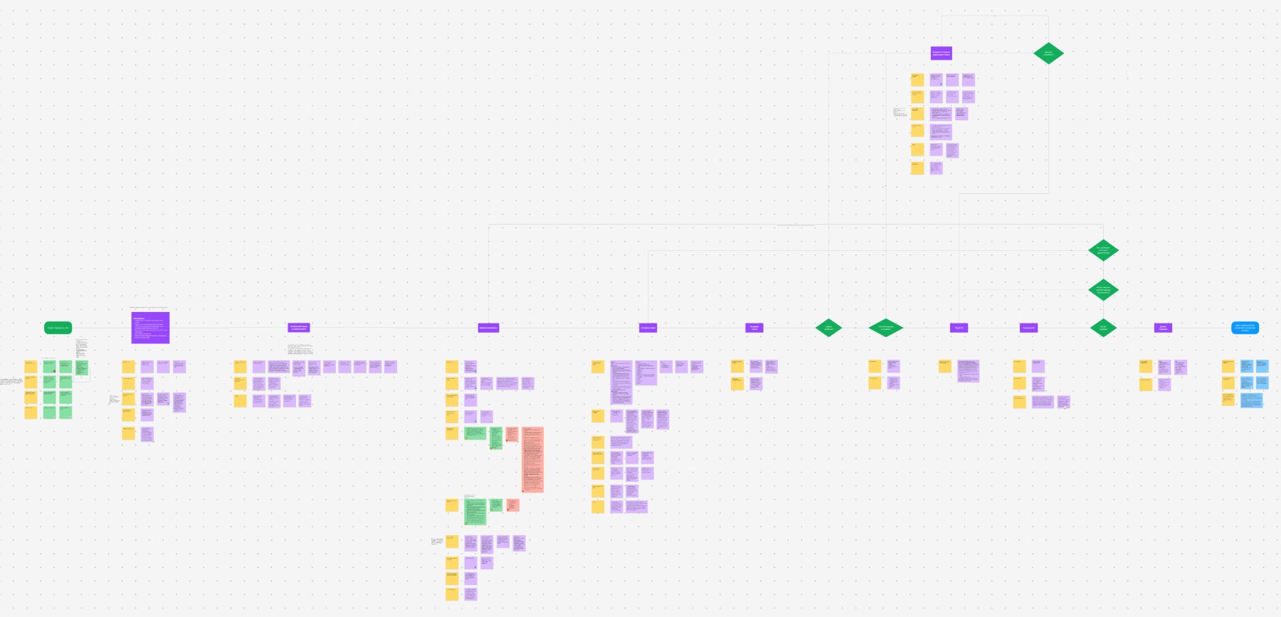
The real value of our product for brokers is probably not the bonus we had assumed, but speed — how fast the whole deal moves: getting an answer from the bank, sending over whatever is missing, and closing the mortgage.
If that is true, then the paper application — download it, fill it in by hand, upload it back — is where the whole thing breaks: it pulls brokers out of the flow and slows the work down.

Round 2 — 10 usability tests on the live MVP
I refined the designs, we shipped the MVP — and about 2 months later I went back to the users. I ran 10 usability tests in their real environment to collect feedback, spot opportunities for improvement, catch anything broken, and check my 2 hypotheses.
People got through the scenario without major problems.
Speed mattered more than anything else in their work — several brokers went straight to the banks instead, simply because it was faster.
Having to handle the paper application form was what annoyed them most.
So it was clear the product needed work — otherwise brokers would simply drop off.
The problem I discovered
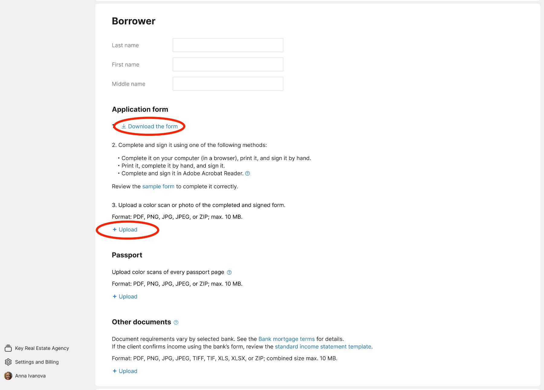
The application form filling happened outside of the interface — it took too much time and effort
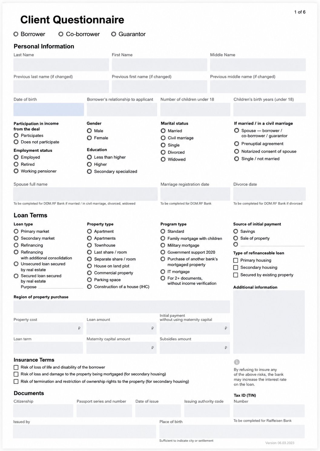
Users had to download the application form from the interface, fill it out by hand or on a computer, and then upload it back. Since form filling happened outside of the product, it took too much time and effort.
In usability testing, users highlighted that filling the application form this way broke their workflow and was inconvenient.
Speed is the most important thing in a broker's job — not the bonus, as we assumed
What I did
In testing, everyone wanted to fill it in place, without leaving the flow.
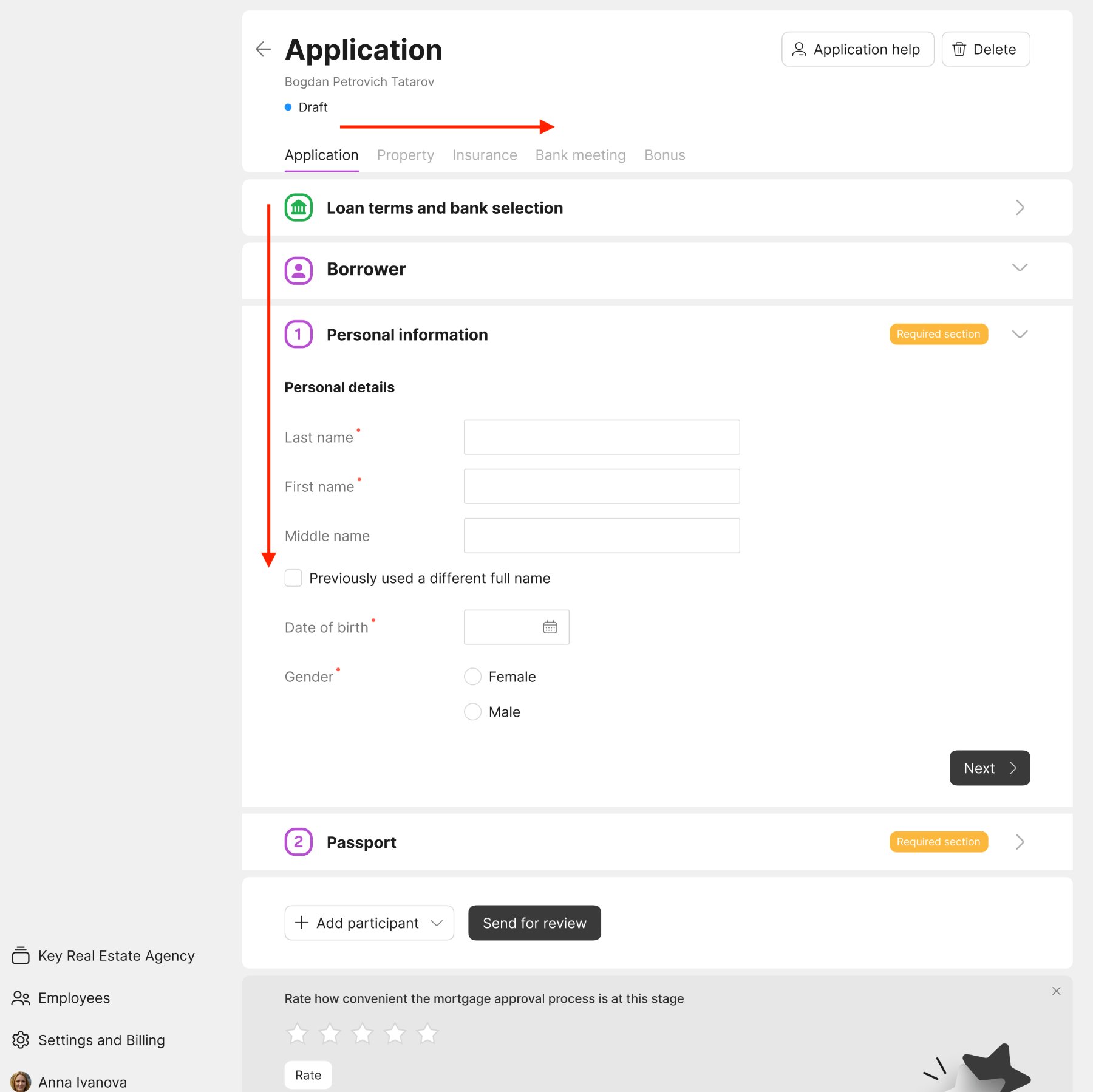
I brought the application inside and turned it into a progressive inline form, so users could complete it without leaving the product. Steps unlock progressively to guide users.
The problem
Even after the research sessions, I was not sure at which point of the flow users would need to see the mortgage terms most. So I placed the entry point in two different places of the scenario and set up metrics on both — to check later which one was barely used, and remove it.
What I did
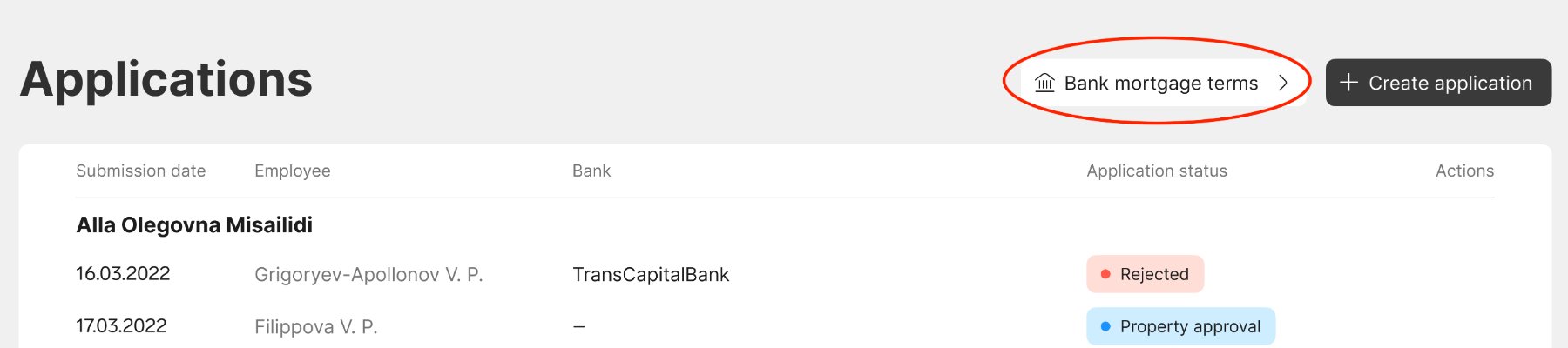
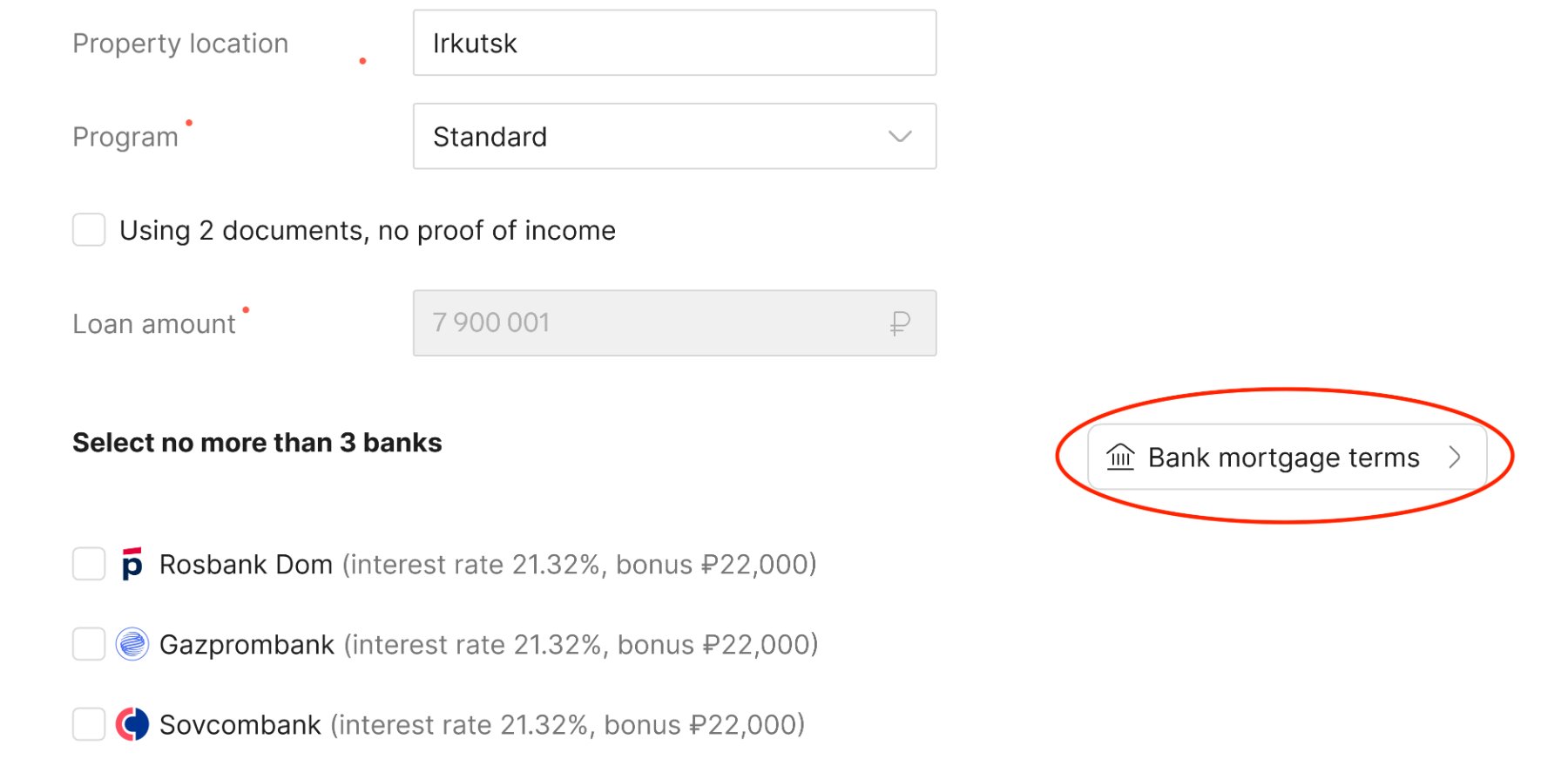
Metrics showed that both entry points were actively used — 290 versus 213 transitions — indicating that the difference in use is not big and both scenarios are valid.
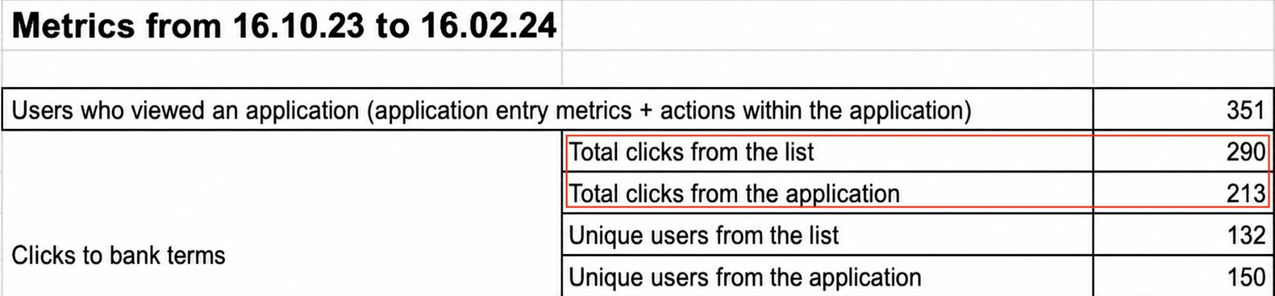
Retain both entry points, since metrics showed 290 versus 213 clicks. Preserving both paths to mortgage terms avoided disrupting established workflows for users.
The problem I discovered
Communication via email was too slow
In the interviews users highlighted the importance of speed in their work and complained about slow communication in the product. They could reach us only via email. So if a bank required some documents, or users had any questions, the only way of communication was sending emails back and forth.
“I need to find a cost-effective solution for faster communication.”
What I did
With a client sitting across the desk, waiting for a reply letter is not an option.
I suggested adding a built-in chat for faster and smoother communication. A direct phone line to our mortgage experts was set up as well.
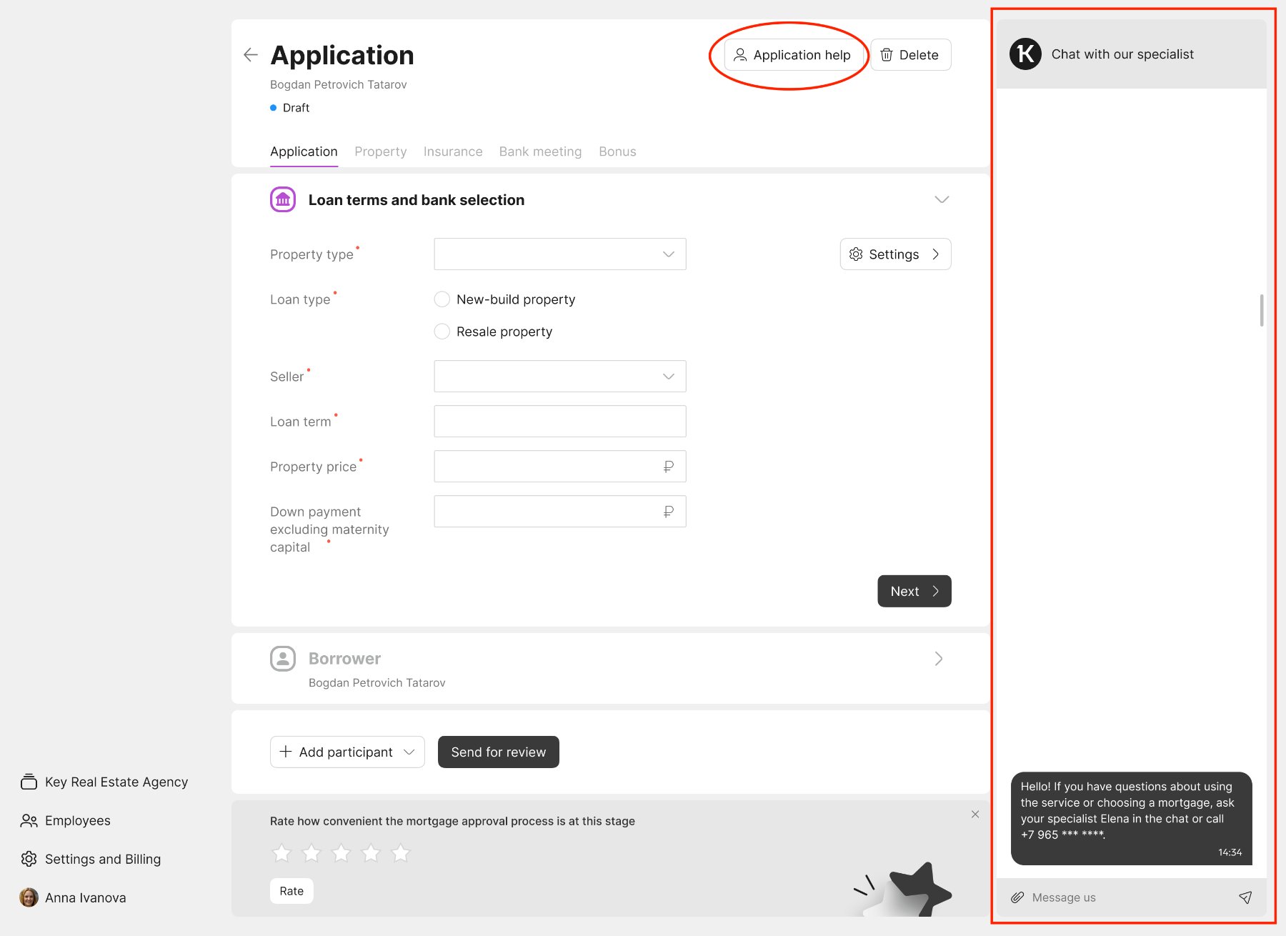
- Filling in the application moved online and became seamless and progressive.
- Thanks to the chat, communication became faster and direct.
- Preserving both paths to mortgage terms, backed by metrics, avoided disrupting established workflows for users.
Users noticed: in the in-product survey, the average rating of the mortgage approval process grew from 2.5 to 4.8.
What I took away
When the business has no clear vision, research helps at every step. Before launch it shapes what the product should be; after launch it shows what to fix and where to go next.