A 3-year-old product where users could not start without support
Expert Check assesses a property, as well as the buyer or seller behind it, and reveals legal and financial risks before a deal. I joined as a sole designer and took UX research as well.
Context
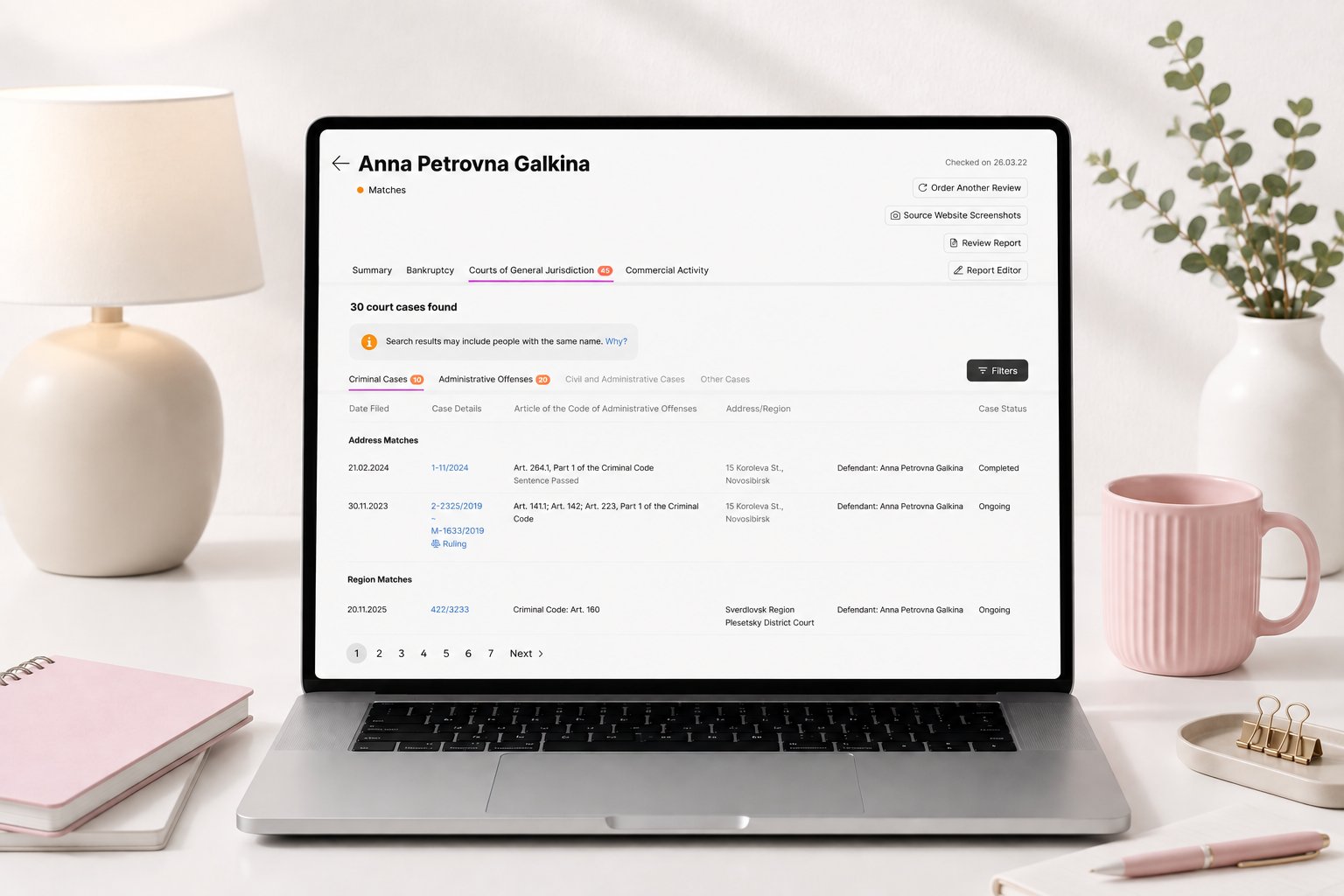
Expert Check aggregates data from many sources and turns it into a clear assessment, so lawyers and real estate agents can show their clients whether a deal is safe.
I was the designer and researcher on this product for more than 4 years — too much to tell in one case, so below are the key decisions I brought into the product.
The product worked — but people could not use it on their own.
Support was the interface
Constraints
The problem I discovered
According to support, users leaned on them to get started at all: our experts onboarded every new user by hand, which took a lot of their time and effort.
Research
I compared onboarding patterns across services and picked the one that fit us most: a linear flow users cannot get lost in.
I ran an unmoderated usability test in Useberry on the onboarding prototype. 39 respondents started the scenario, 22 went all the way through. Completion was never the point — the point was whether people could start using the service without our support experts.
They could. Ordering a check went quickly and without stumbling — 1 to 3 minutes on average — and nobody got stuck at the beginning.
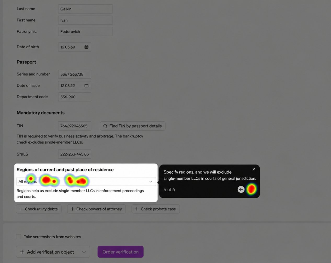
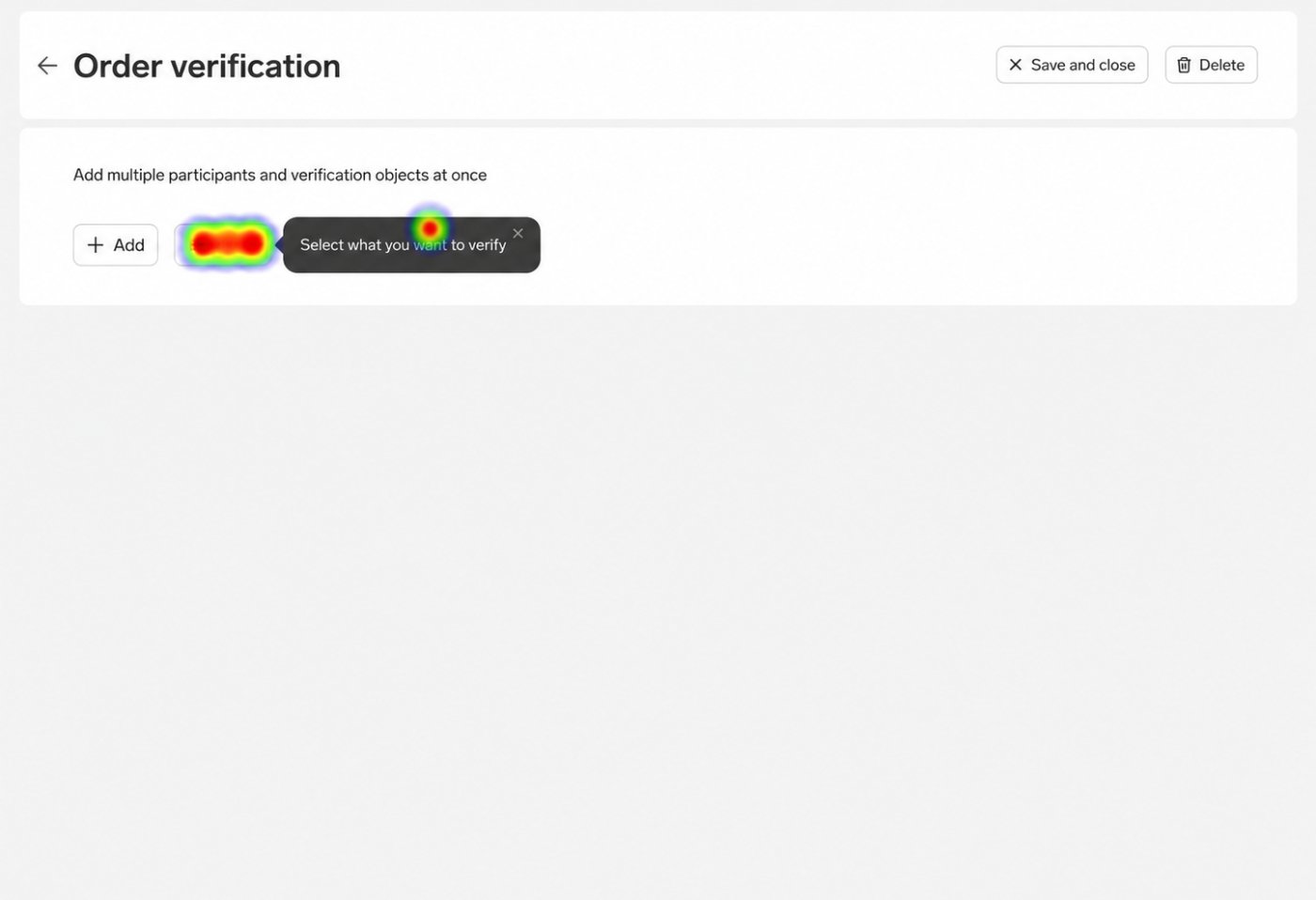
What the feedback said about the prompts:
- most people liked them
- some found the interface clear enough without them
- a few were annoyed and wanted to close the tour — which they could, and restart it later from the main screen
What I did
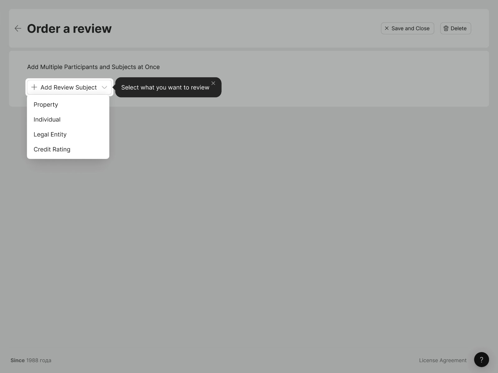
Key features of the final onboarding:
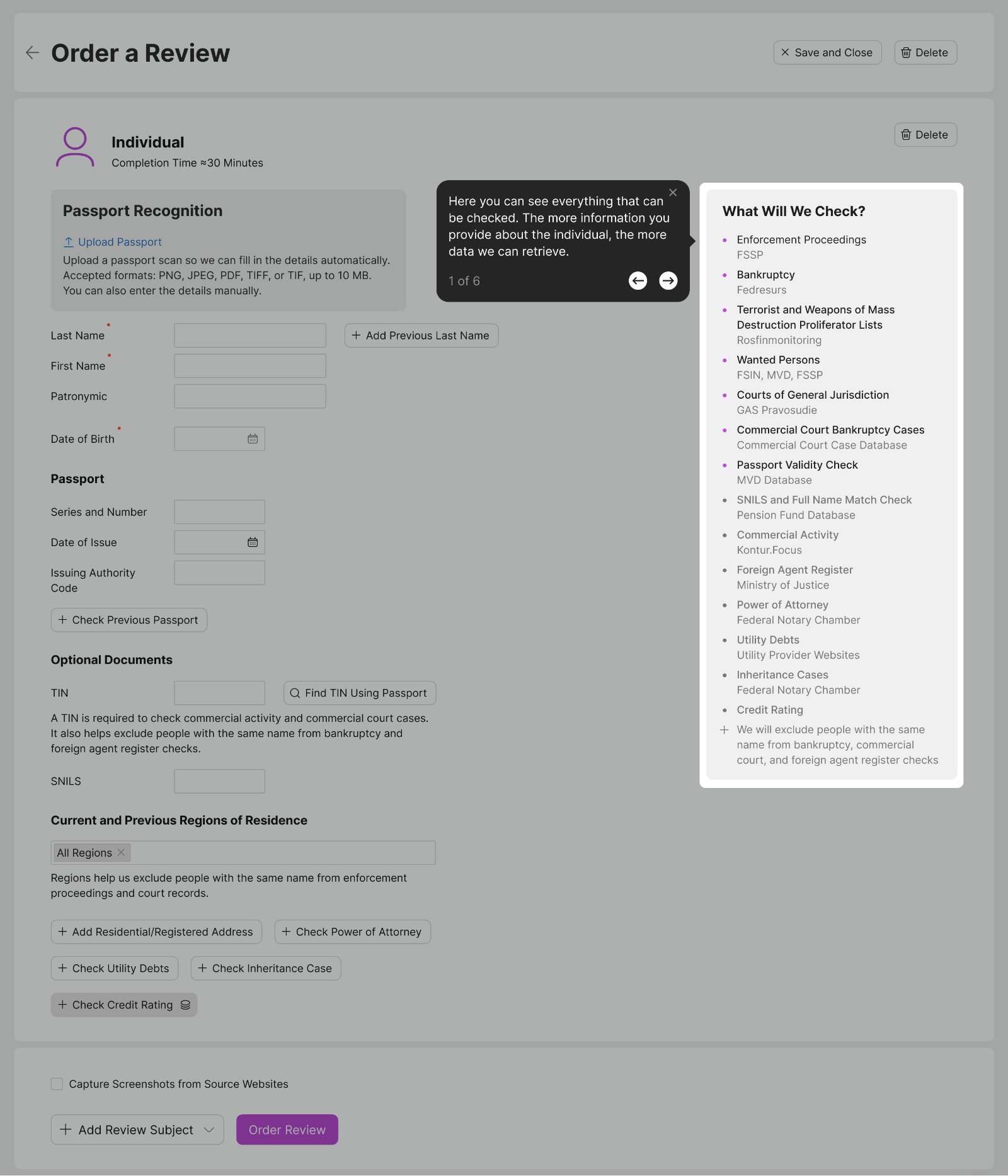
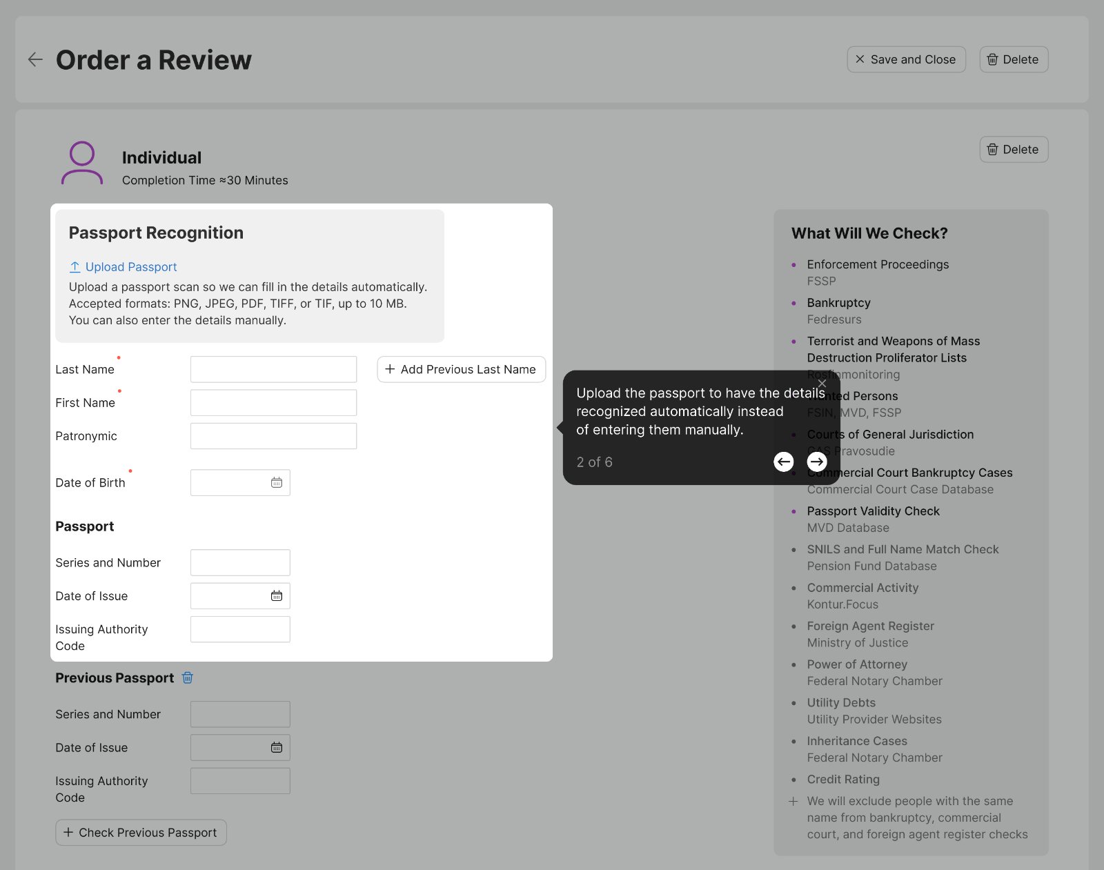
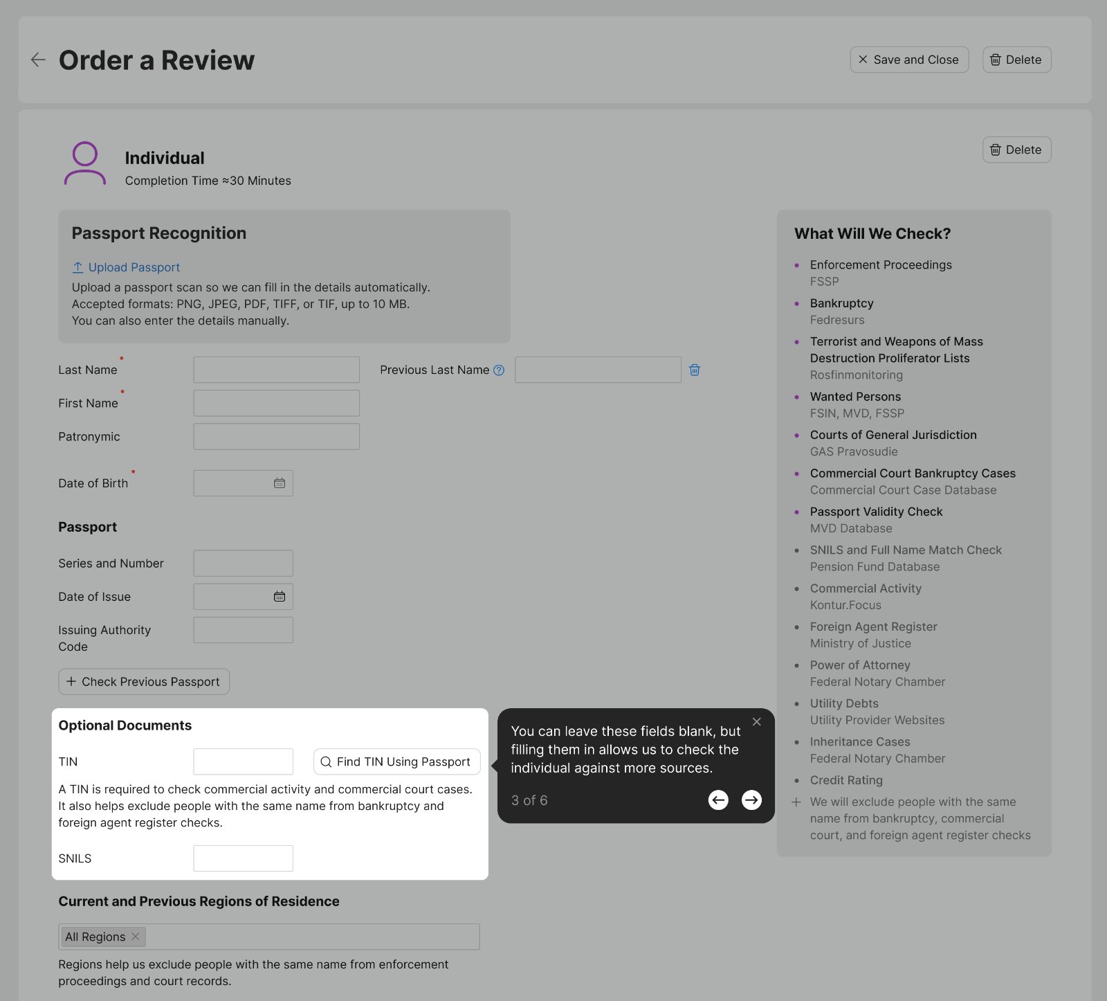
- The rest of the page is disabled on purpose — with everything clickable there were too many ways to get lost, so the tour shows one piece of the interface at a time and walks users through it.
- Users can go back and review previous steps.
- The number of remaining steps is visible.
- The tour can be closed at any moment and restarted later from the main screen.
Context
The PDF report was the main artifact users received after assessing a person or a property. Lawyers and real estate agents used these reports to show their clients that a deal was safe.
The problem I discovered
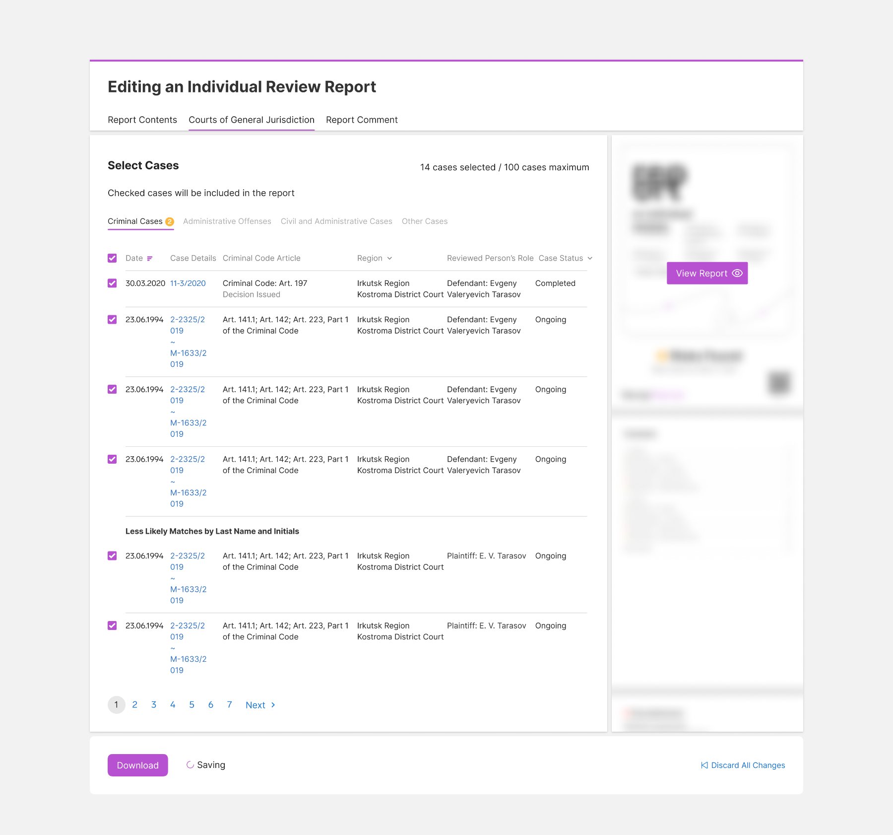
Going through support requests, I found that 38% of them were about editing the report in one form or another — most often about the courts of general jurisdiction section.
That search could only run on a person's full name — the data source accepted nothing else to narrow it down. The section returned a long list of mostly irrelevant cases.
The report could not be edited, so users cleaned it up in third-party tools outside the service before showing it to a client — slow, awkward and annoying.

Research
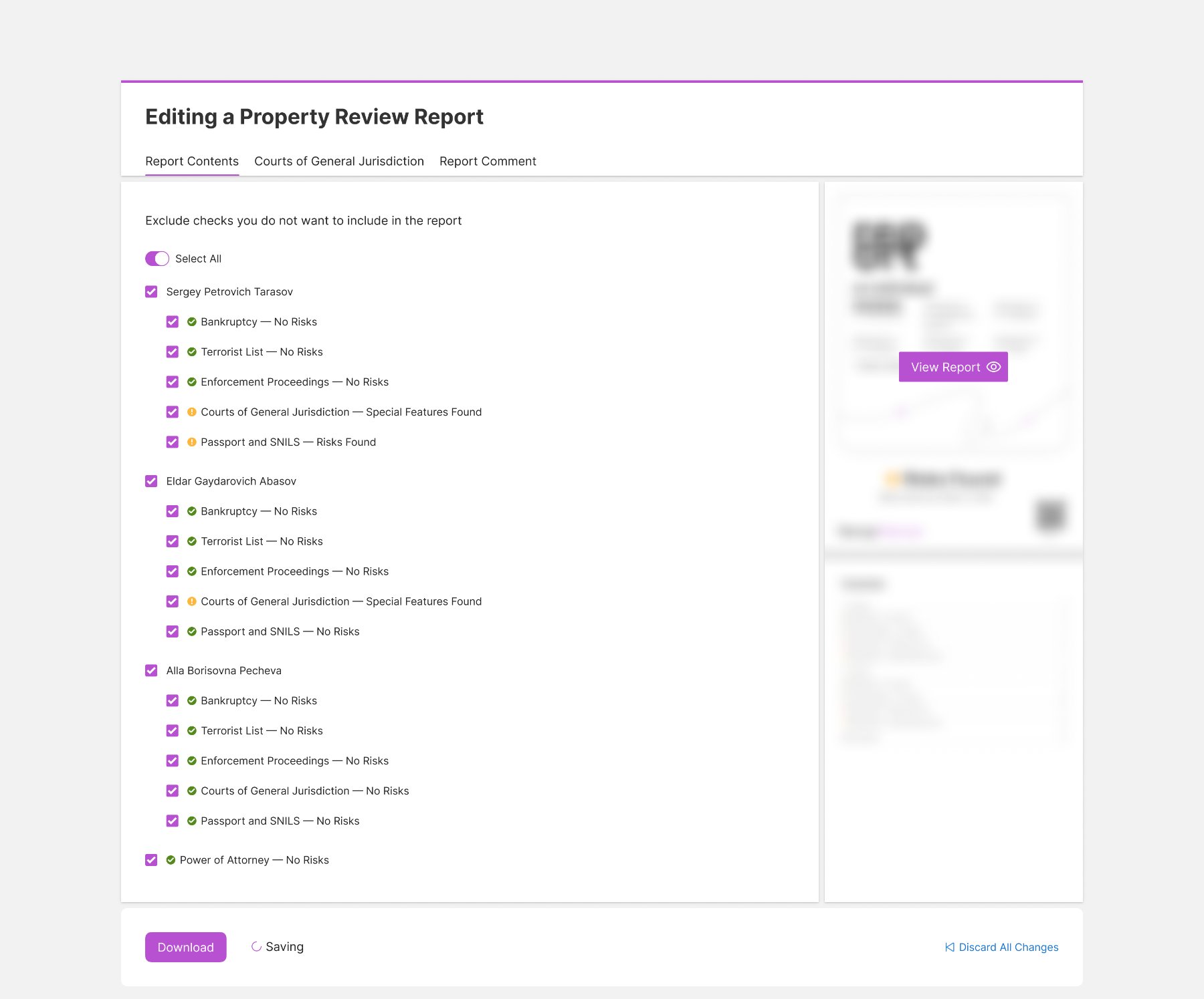
I designed the editing flow and ran 6 moderated sessions with interview elements. The first two showed the scenario was not viable, so the core logic of the report constructor was changed: instead of asking users to select everything to include, I let them exclude what is irrelevant — a few clicks instead of dozens.
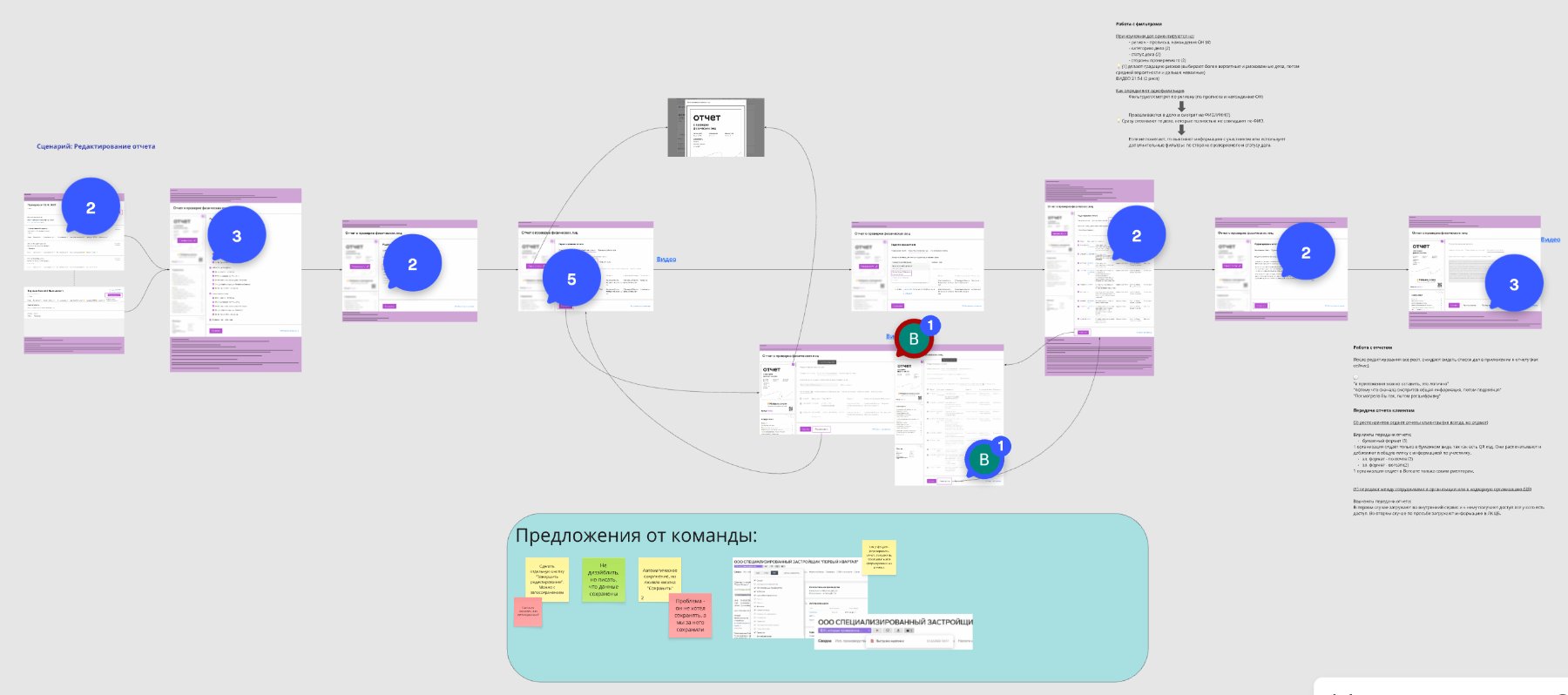
After the change nobody struggled with the scenario again. I made a few small fixes — removed an unnecessary transition, clarified participant selection, added case counts — and handed the designs over to development.
What I did
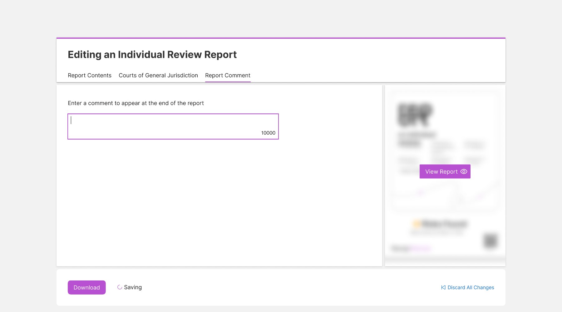
Main features of the report constructor:
- Exclude individual cases from the courts of general jurisdiction section — the biggest pain point users wrote to us about, though most other sections can be edited too.
- Preview the report before downloading it, to see exactly what was edited.
- Discard all changes and roll the report back to its original state.
- Leave a comment that appears at the end of the report.
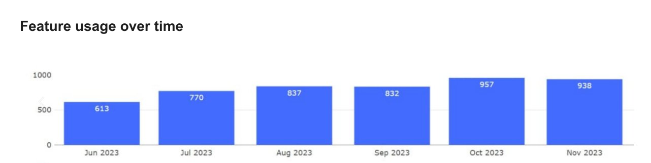
Usage grew steadily after launch: from June to October 2023 the number of organizations editing their reports went from 613 to 957 — a 56% increase.
The problem I discovered
There was no credit rating in the interface, and users kept asking for it. The initial plan was to show a bare number with a minimal explanation — but a bare number is hard to interpret, while a visual scale is read and understood far faster.
What I did
I proposed visualising the data so the rating could be read at a glance: a colour-coded scale with ranges, a plain-language verdict and its consequences. I also designed a distinct state for cases where the rating cannot be calculated.
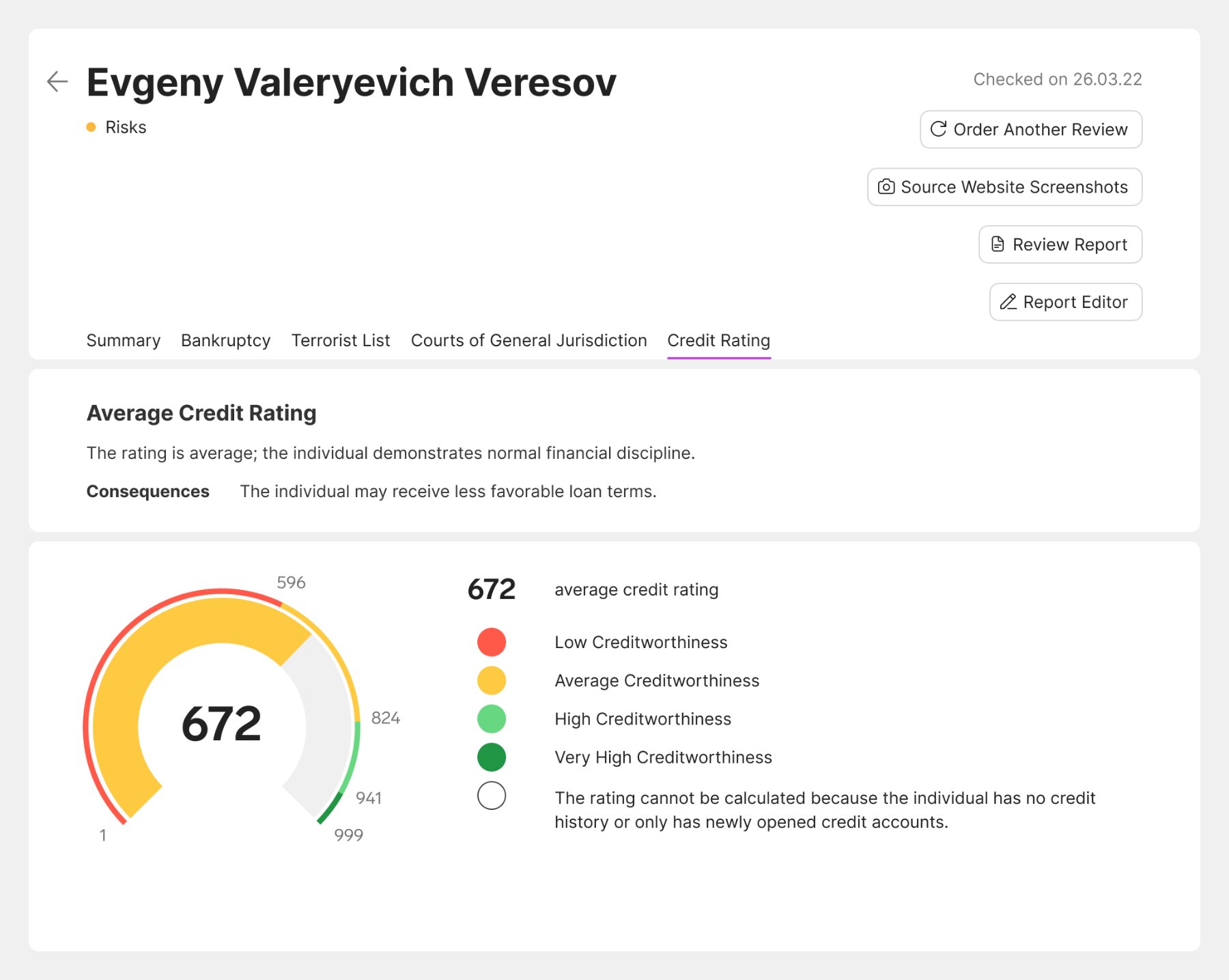
Credit-report usage kept growing after release: active organizations ordering them went from 172 in October 2024 to 302 in February 2025 (6.72% → 11.46% of all active organizations), with a 94% monthly return rate among repeat users.
The problem I discovered
The company had a design system covering 70+ products, but it had never been brought down to the product level — when I joined Expert Check there was no local library at all. Keeping the interface and its patterns consistent was hard, and keeping the mockups up to date was so slow and expensive that it mostly did not happen.
To make design work faster and unify patterns across the product, a product-level component library had to be created
What I did
I built the first component library for Expert Check — aligned with the company design system, but adapted to what the product actually needed. All tables and main screens were rebuilt on components.

Design time for comparable features dropped by 30%, with far fewer manual fixes. The library also laid the groundwork for a shared Kontur Real Estate library, which we started building together with two other designers.
- The onboarding pattern I built was later adopted by 2 other products of the company.
- The onboarding let users start working with the product on their own, without help from our support — which took a significant load off them.
- Support requests related to report editing, directly or indirectly, dropped from 38% to 8%, and usage of the feature grew by 56% between June and October 2023.
- Active organizations ordering credit reports grew from 172 to 302, with a 94% monthly return rate among repeat users.
- After the component library, design time for comparable features dropped by 30%.
What I took away
In a mature product it is important to notice where the product silently relies on people — support, newsletters, third-party tools — and giving that job back to the interface.