Market · retail inventory app
Mobile app redesign and component library from scratch, in 2 weeks
Store staff use this app to follow revenue, sales and cash registers — usually standing on the shop floor, in a hurry. I redesigned it during my internship in the mobile team — building the component library as I went
Category
Retail
My role
UX + UI design
Platform
Mobile
Context
Internship, mobile team
Timeline
2 weeks
Context
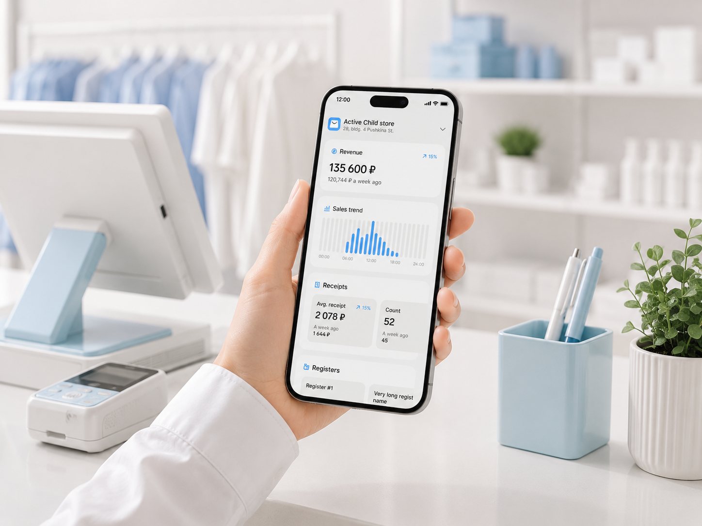
Market is a service for inventory management in retail. It allows checking stock levels, sales, revenue and cash registers.
The interface was outdated and inconsistent, and my task was to redesign it, simplify the key flows and make the patterns behave the same way everywhere.
There were no reusable components,
so the same pattern looked different on every screen
Constraints
2 weeks
One short internship task
No design system
Every screen had its own version of each element
Small screens, real data
Long names and 7-digit sums on a phone
What I did
1.
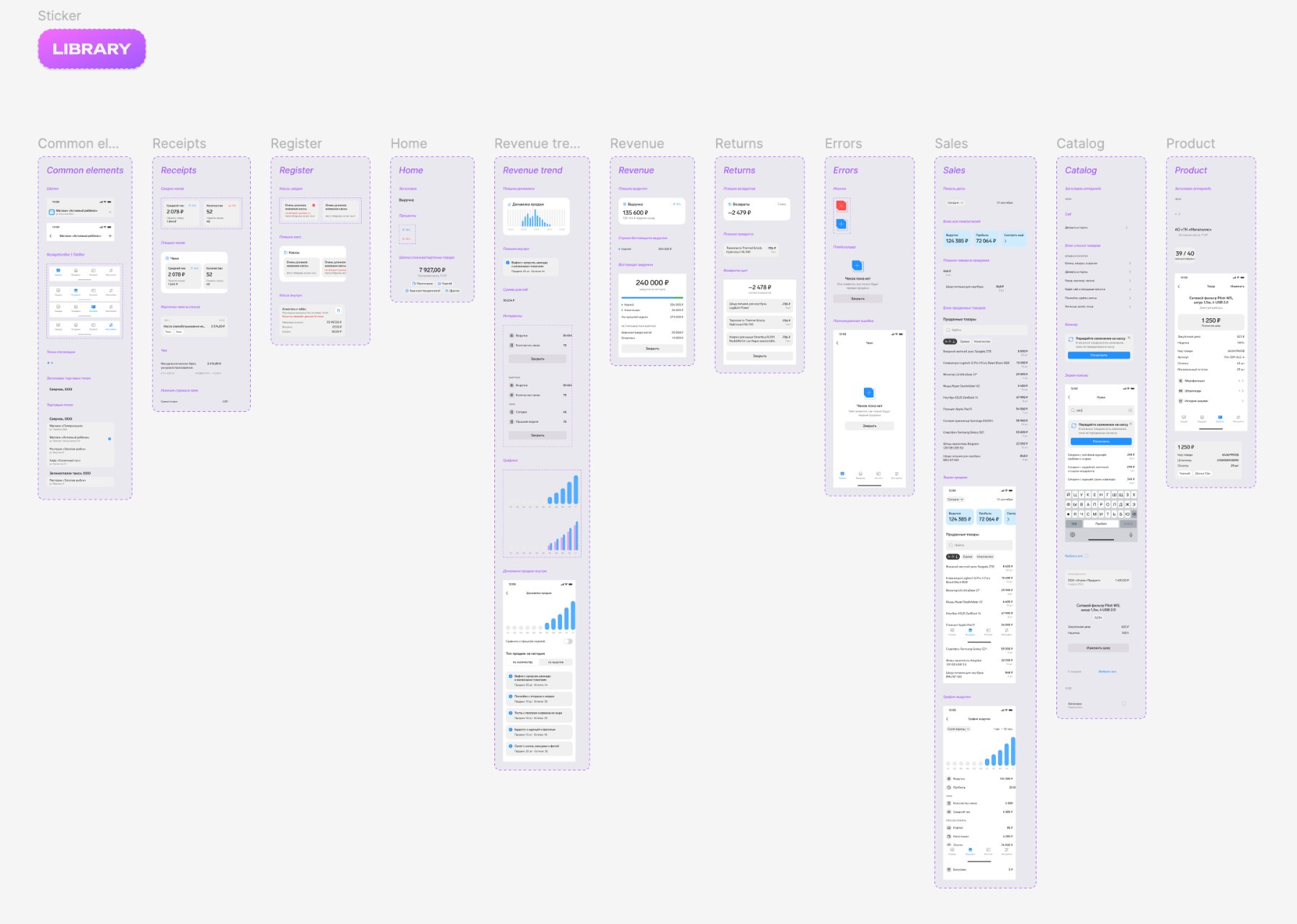
Built the component library as I designed. As soon as a pattern reached its final look, it went into the library and was reused on the next screens — which standardised the interface and made every later change fast.
2.
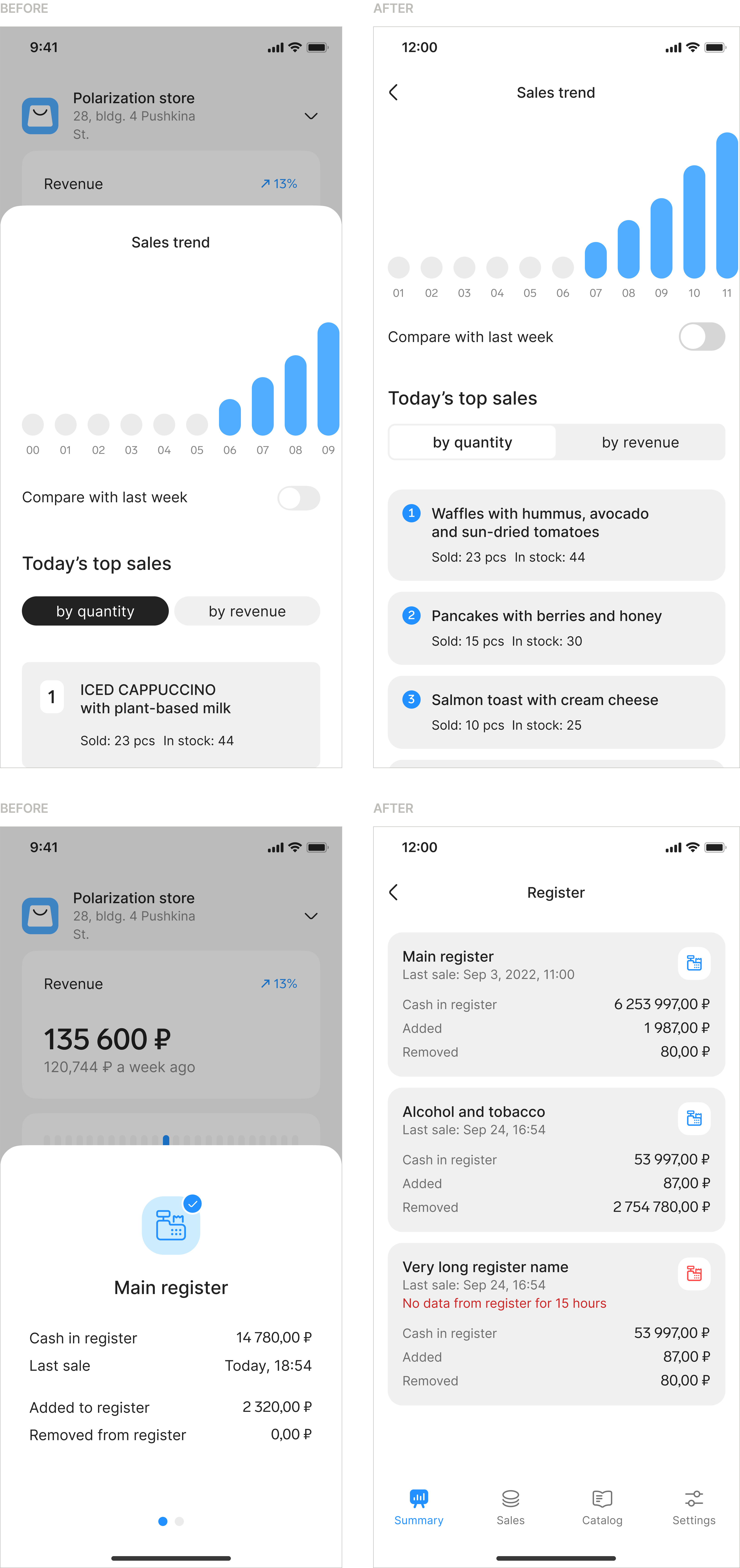
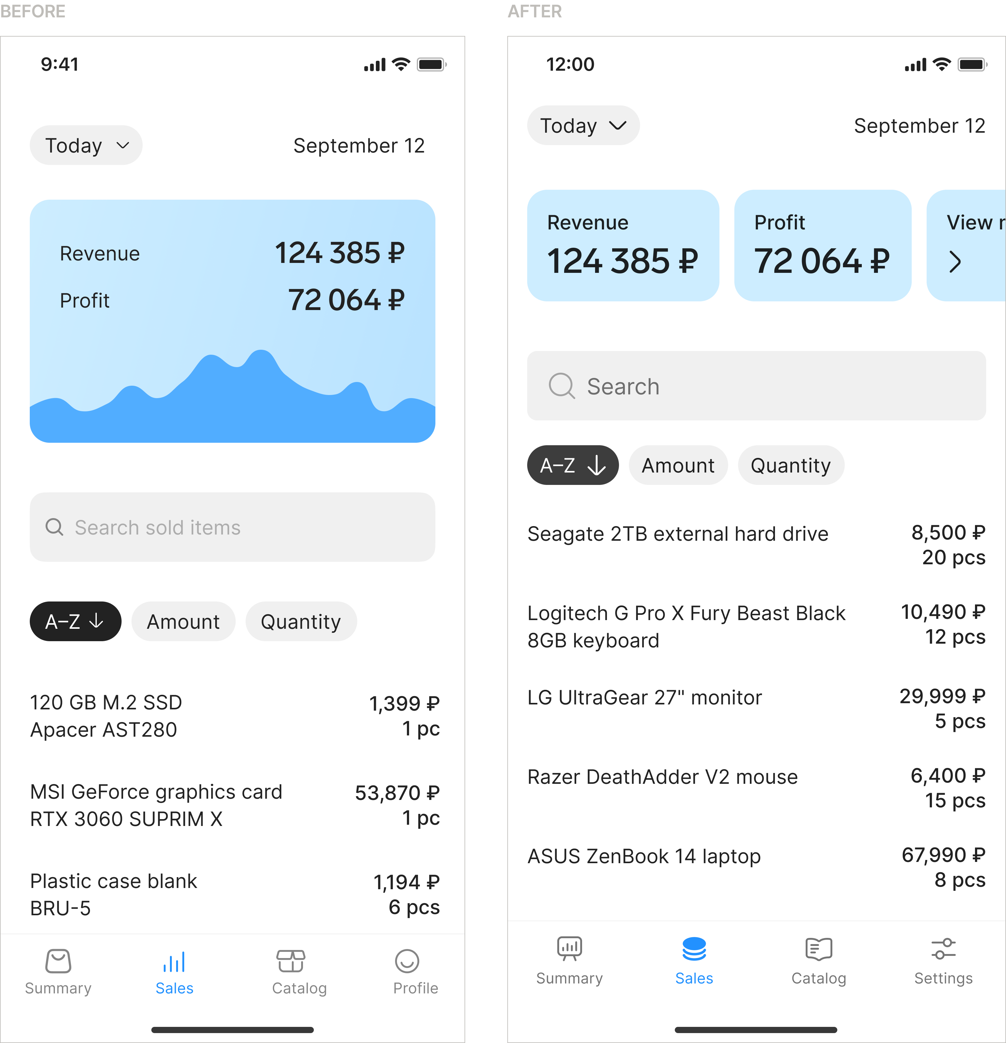
Replaced bottom sheets with full-screen views. Those screens carried too much data for a sheet: users saw only a part of it and had to scroll inside a small window. On a full screen everything fits at once, so the numbers are easier to read and the task is faster to finish.
3.
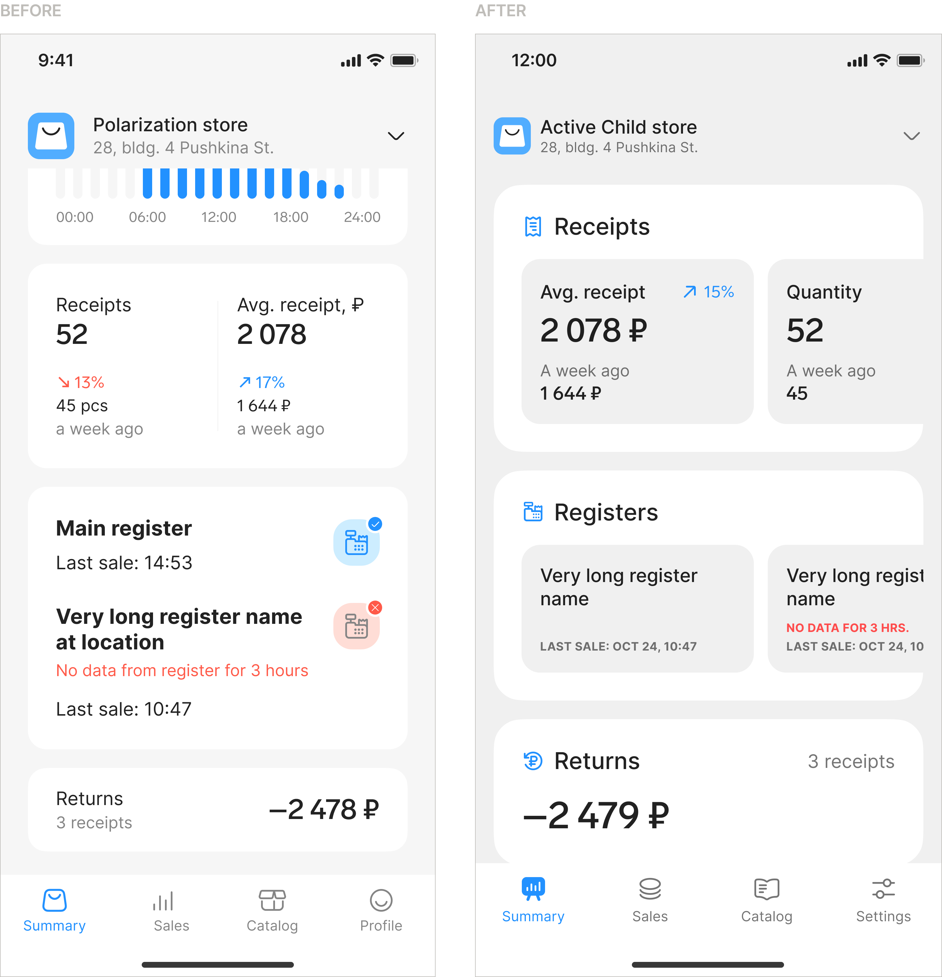
Introduced a horizontal scrolling pattern. The layout on the main screen used to break in the receipts block whenever a value went over 6 digits. The new pattern shows data of any length correctly and removes the constraint of a fixed-width layout.
4.
Fixed a chart that showed nothing. A large chart took the top of the sales screen, and nobody on the team could explain what it meant: it reflected no real data and never changed — it was there for decoration. I replaced it with a horizontal scroll of key metrics, so the space now carries numbers users can actually read.
Impact
- The full redesign and the component library took 2 weeks, as planned.
- The library became the foundation the team could keep building on: consistent patterns, faster changes, nothing to relearn between screens.
- The app got a new visual language — new colours, new components, one style across every screen instead of an outdated patchwork.
- Key data stopped hiding: bottom sheets became full screens, so the numbers fit without scrolling inside a small window.
- The interface stopped breaking on real data — long names and 7-digit sums now fit thanks to the horizontal scrolling pattern.
- A decorative chart that showed nothing was replaced with real metrics, so the most valuable space on the screen finally works.
~40%
faster to make changes to the screens once the component library was in place
1
mobile team happy with the redesign, the new library and the 2-week deadline being met
What I took away
Build the library while you design — every finished pattern is reused straight away, so the work goes faster and the product stays consistent
Alena Slastnikova · Product Designer
Next case: Product Labeling →