I was handed a ready solution and found a better one
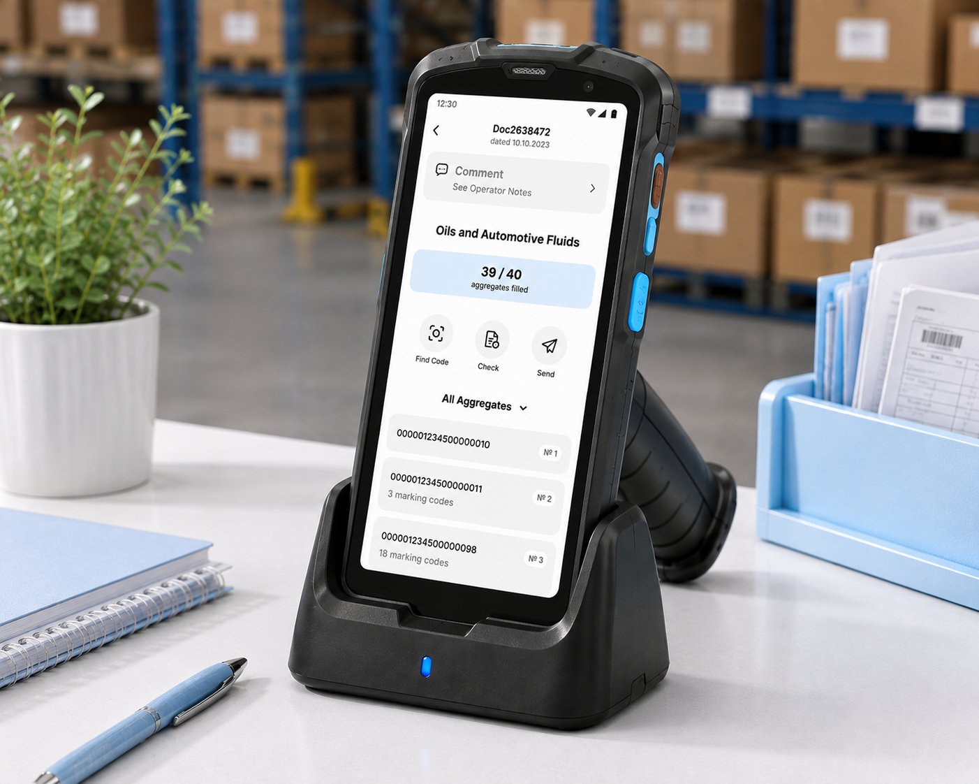
In Russia, many goods cannot be sold without a digital label. This app is how warehouse and retail staff work with the National Labeling System —
on a phone or on a handheld scanner.
Context
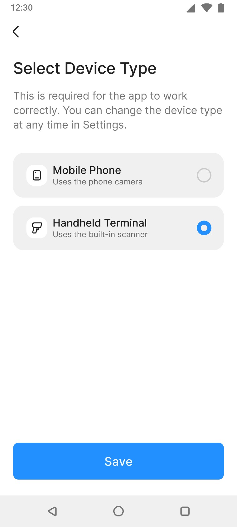
The app runs on two different devices: a smartphone (scans with the camera) and an Android-based handheld scanner (scans with a built-in scanner or camera). The app has to know which one it is dealing with — and it sometimes gets it wrong.
I received the task from an analyst, with the solution already decided: show a device confirmation screen once, at first login.
Users could not change the device type themselves.
Every correction went through support
Constraints
The problem I discovered
I dug into the domain and, drawing on earlier UX research I had run on onboarding flows, I questioned the proposed solution. When people are in a hurry to start working, they may skip onboarding screens — so there was a good chance the device confirmation step would simply be passed over.
And if someone ended up with the wrong device type, they would only find out later, when the scanner would not open — and then have to go looking for a way to change it.
A step that matters for the core task should live next to that task — not in onboarding, where it can get skipped
What I did
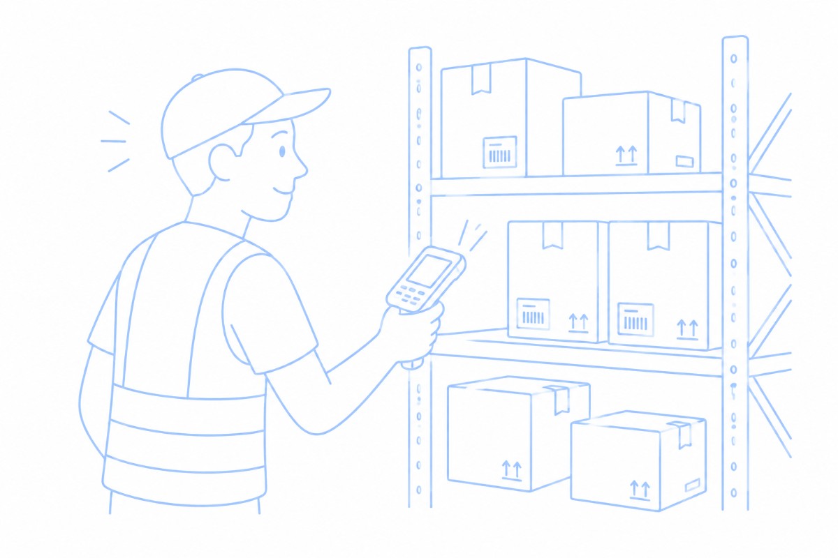
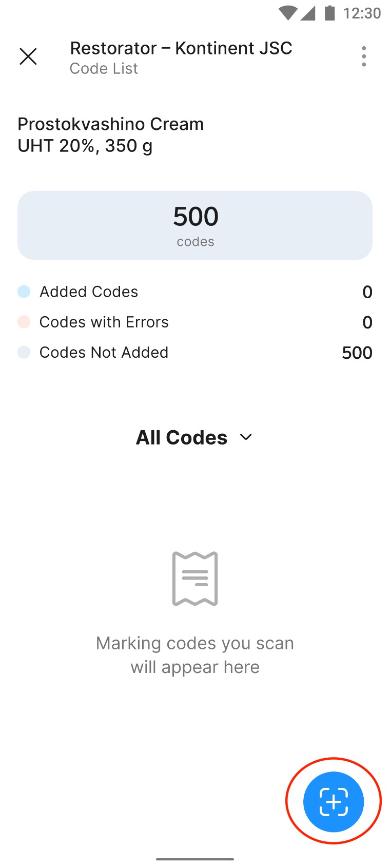
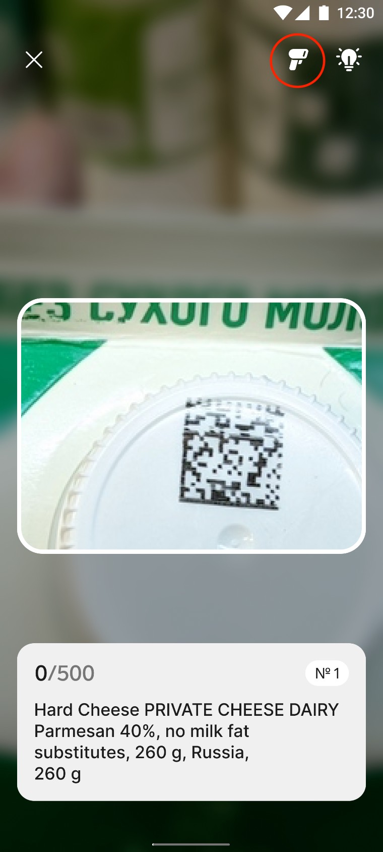
I moved device selection into the scanning flow itself, so users choose between the phone and the handheld scanner right before their first scan — and the app remembers the choice without interrupting them again. Two decisions carried the design:
- The choice appears right before the core action — scanning.
- The device can be switched from the scanning screen itself, so nobody has to search through settings or go to support.
I walked the team through my earlier onboarding research and convinced them that this was the solution that actually addressed the users' core problem.
This was a contract task: I designed the feature and moved on to another team inside the company, so I never saw the long-term numbers. What I do have is this:
- Positive feedback from the Labeling product team — in particular from the product manager and their lead salesperson.
- A linear, predictable flow, where the critical step sits right next to the action it belongs to.
- Users got control over the device type: switching it no longer meant writing to support.
What I took away
Relevant experience from previous projects can sometimes point you to a more efficient solution than the one proposed by someone with lots of experience in the given domain.