The brief asked for one toggle.
A full redesign of the scenario turned out to be the answer
Admin let companies connect their Active Directory to manage devices remotely. Most users couldn’t complete that connection on their own — 26% of all support tickets were about this one scenario.
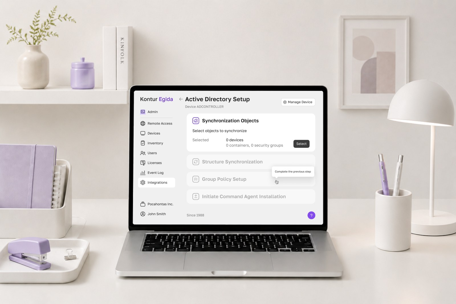
Context
One of my first tasks on the Admin team was to “add a toggle” to the Active Directory connection flow. It was meant to let companies not only see their Active Directory structure in Admin, but actually manage it. I tried to walk the flow myself, got stuck, and asked the analyst to go through it with me.
In practice that meant installing software on selected devices and running inventory.
So I went to the 2 backend developers who had built the scenario, and reconstructed it with them. That was the first time the flow existed as something anyone could look at end-to-end. It had been created by those 2 developers alone, which explained the state it was in.
The whole piece of work took approximately 2–3 weeks.
It turned out the analyst who asked for the toggle had never gone through the scenario — so I went digging myself
Research & discovery
- Walked the whole scenario with the 2 backend developers who had authored it
- Mapped the entire user flow — the team's first end-to-end picture of it. Here is the screen from Notion.
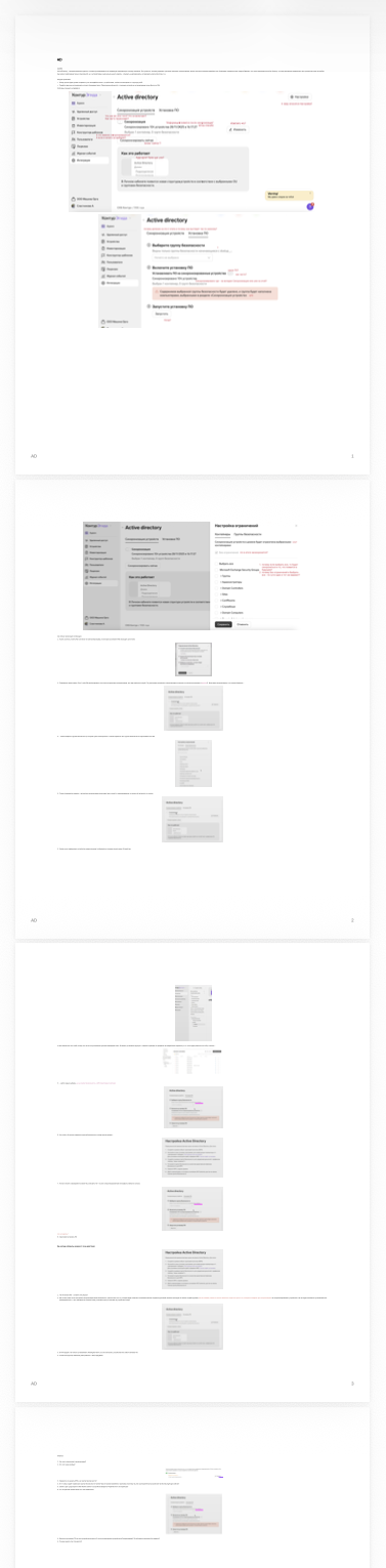
User flow — Notion - Went to support, then set up metrics to see how long the flow really took
- Walked the whole scenario step by step with the 2 backend developers who had authored it
- Went around the team with questions and collected the context nobody held in one place
- Drew the entire user flow, marking every ambiguous step and dead end
- Talked to support, who were walking users through the flow by phone
- Set up metrics on the flow and came back later to read them
During the research I spoke with multiple team members, as no one held the full context of the flow. I also realised that adding a single toggle would not solve the problem — it would introduce even more complexity into an already nonlinear scenario.
The proposed solution
The analyst suggested adding a single toggle: “Create group policy and security groups.” It was supposed to allow managing devices within these groups without requesting permissions each time.
However, it was unclear:
- what this toggle actually does
- what outcome users should expect
- how it fits into the overall flow
The interface as I found it
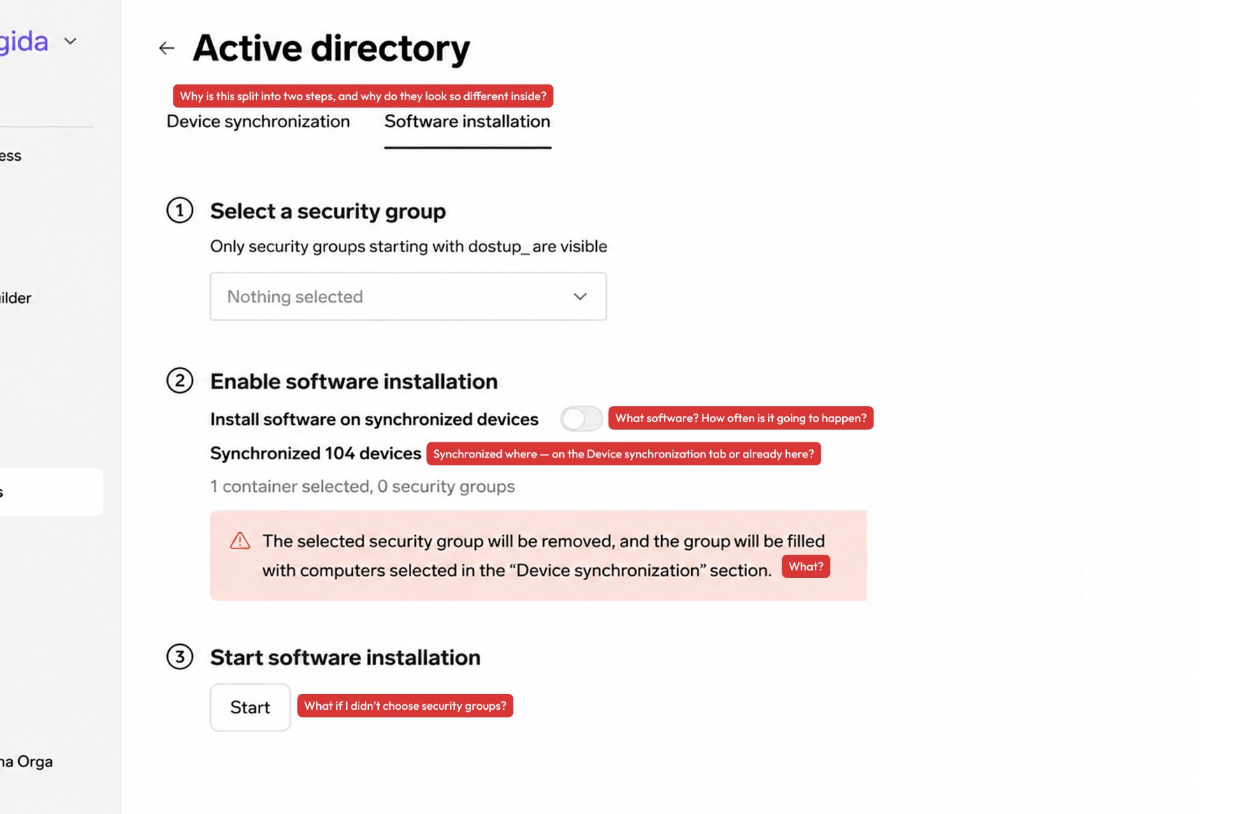
Screens from the original product, translated from Russian for this case study. The red labels are the questions I had while walking the flow — the interface answered none of them.
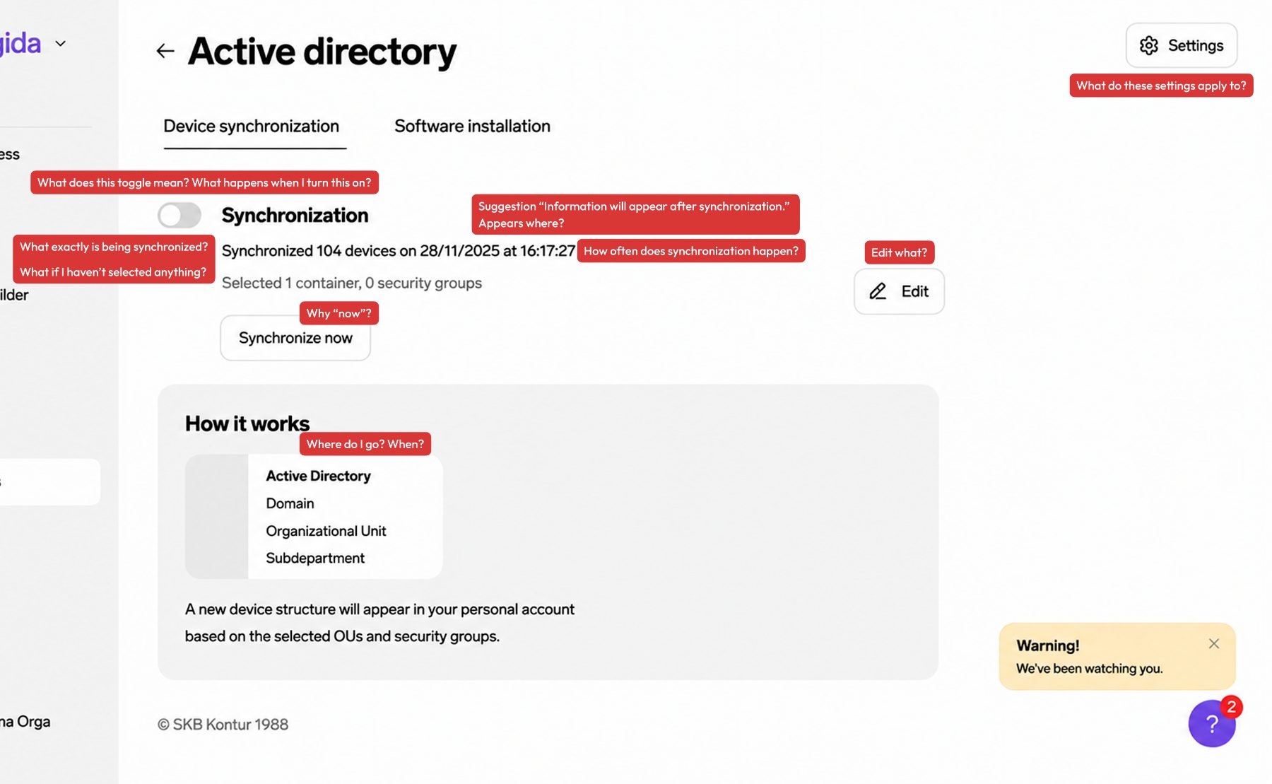
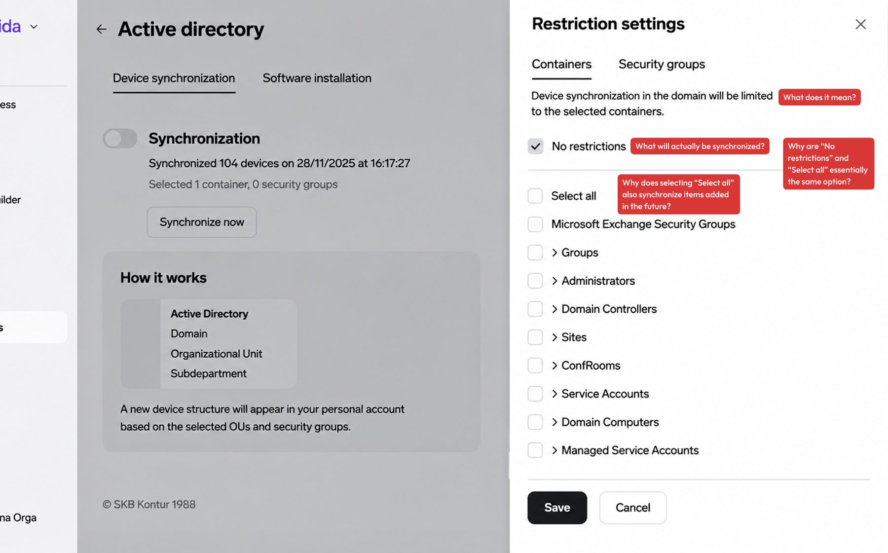
The problem I discovered
The flow was nonlinear and confusing
Steps could be taken in any order, with dead-end branches and no sense of progress. For a first-time user it was simply unreadable — so they called support instead. The problem was not a missing toggle, but a broken flow.
Users often had to contact support to complete the flow — they got stuck, lost track of the steps, went down the wrong paths, and the interface confused them instead of guiding them.
Adding the requested toggle would only add more complexity to an already nonlinear flow
My hypothesis
Since I had already mapped out the entire user flow, I could see that this scenario could be made completely linear. There was no reason for it to branch the way it did.
So I sketched a rough concept of a step-by-step flow and took it to the team to verify.
What I proposed
I called a meeting with the team and put 2 options on the table:
In the room: product manager, development manager, developers, and the rest of the team and business.
- single toggle (the initial proposal from the brief) — the option if there was no time for anything bigger
- full redesign of the flow
I brought the design concept with me, so they could see the difference instead of imagining it.
- Quick fix — add the toggle (low effort, low impact)
- Full redesign — restructure the flow into clear, logical steps so users can complete it independently
I mapped the broken flow, demonstrated why the proposed toggle would add complexity without solving the underlying problem, and recommended the full redesign. The team approved this direction despite the tight timeline.
“Expose one decision at a time — so there is nowhere to get lost. One step is always active in front of you.”
I was able to convince the team that the redesign was necessary — helped by the fact that I already had the concept in hand, so the design itself wouldn't take long.
There was no room for formal interviews or usability testing, so I ran informal hallway testing with team members while designing — checking that a genuinely complex scenario read correctly, and that people could get through it.
What I did
To address the non-linearity of the flow, I made progression between steps dependent on completing the previous ones (progressive disclosure). This helped reduce the user's cognitive load.
- Reframed a nonlinear scenario as a clear sequence with explicit dependencies between steps
- Removed the ability to skip important steps
- Introduced a clear structure and statuses — users always know which stage they're at
- Removed dead-end branches and unnecessary actions
Additionally, I reworked the sub-flow for selecting devices to synchronize. This was my own initiative, as this part of the flow was also difficult to complete — the hierarchy of elements was unclear, much of the wording was misleading, and some essential features were missing (such as managing multiple objects and sorting).
The redesigned flow — one decision at a time:
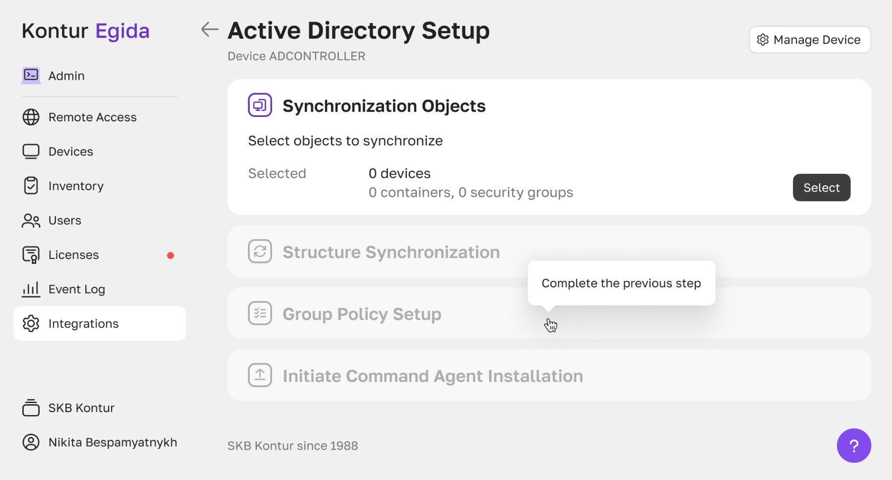
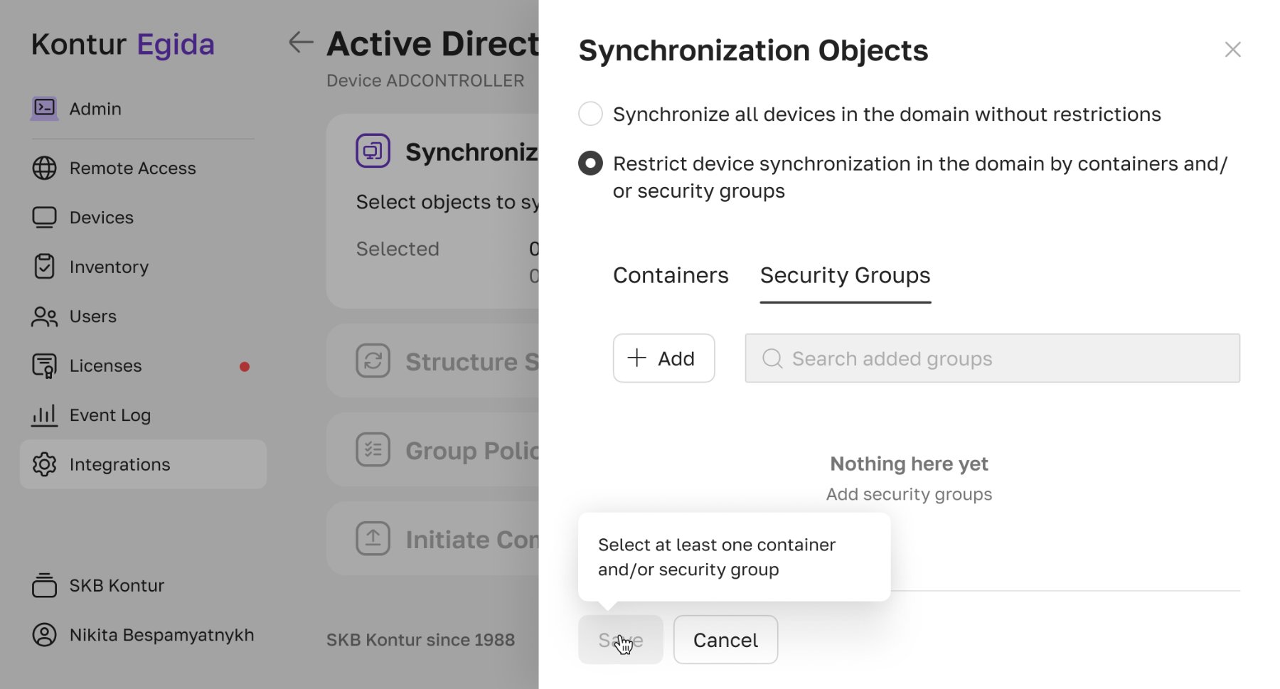
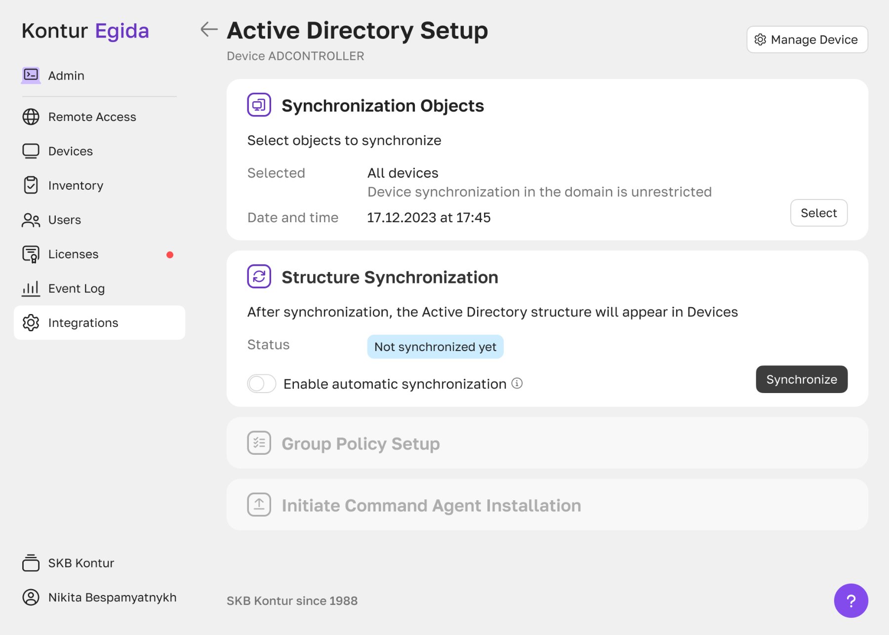
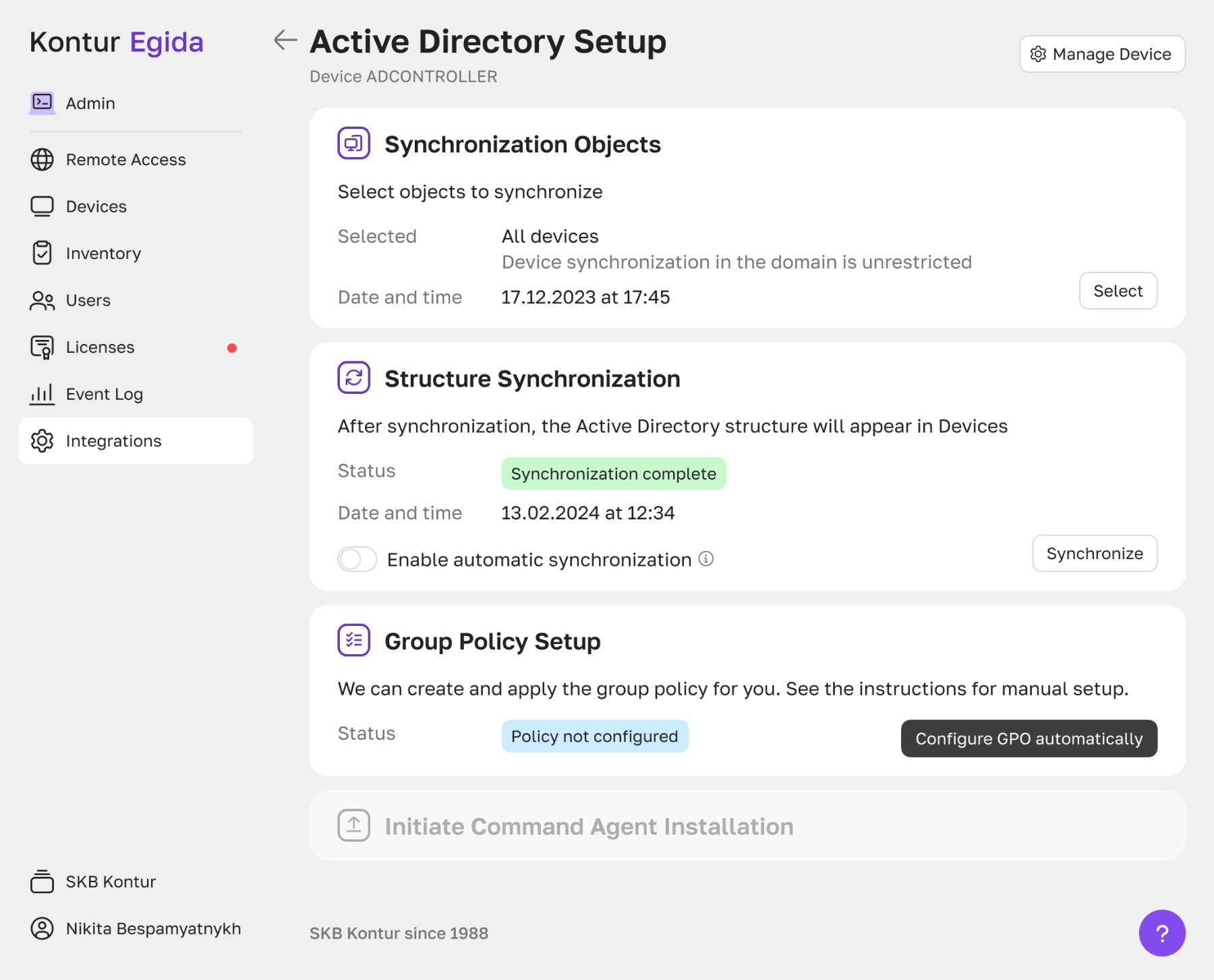
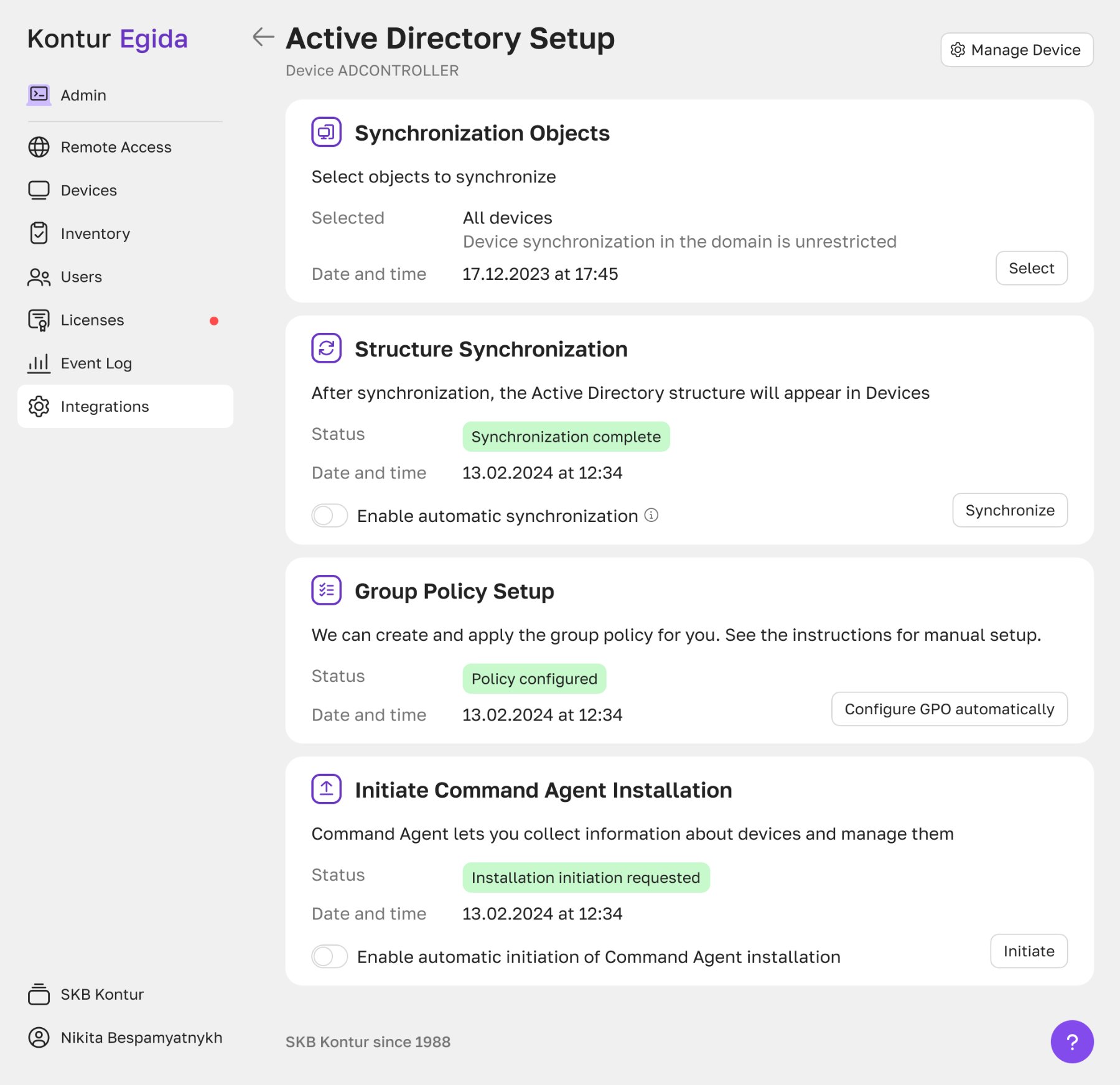
I saw clear opportunities for improvement, and the team supported me in pursuing them. The redesign introduced a clear step-by-step structure that addressed the core usability issues and let users manage their Active Directory structure successfully.
The redesigned flow reduced the median completion time for successful configurations by 88%. As a result, users could complete the flow independently without relying on support.
What I took away
The initial request isn’t always the solution to the true problem. You have to dive into the scenario yourself to discover the real problem — and to solve it.